Aptitude Software
Aptitude Software
AGENCY
AGENCY
Moove
ROLE
UI Design & Interaction
WORK
Case Study Design
The Challenge.
The Challenge.
Moove agency asked me to design a new case study for one of our global clients with the headquarter in the USA. I have been given the case study copy text in a Google doc and the freedom to explore and produce a creative user interface.
I love this kind of challenge! :-)
The Golden Ratio always inspired me. It appears in some patterns in nature, architecture, paintings... as it is aesthetically pleasing.
The Golden Ratio (also known as the Golden Section, Golden Mean, Divine Proportion or Greek letter Phi) exists when a line is divided into two parts and the longer part (a) divided by the smaller part (b) is equal to the sum of (a) + (b) divided by (a), which both equal 1.618.
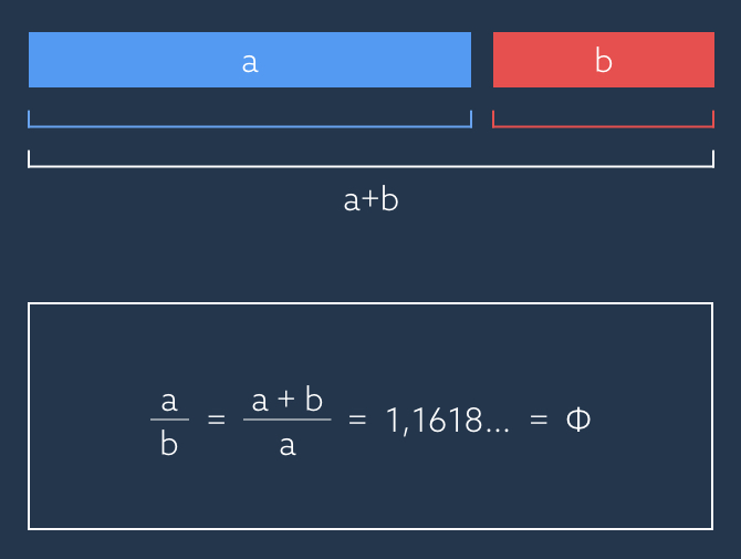
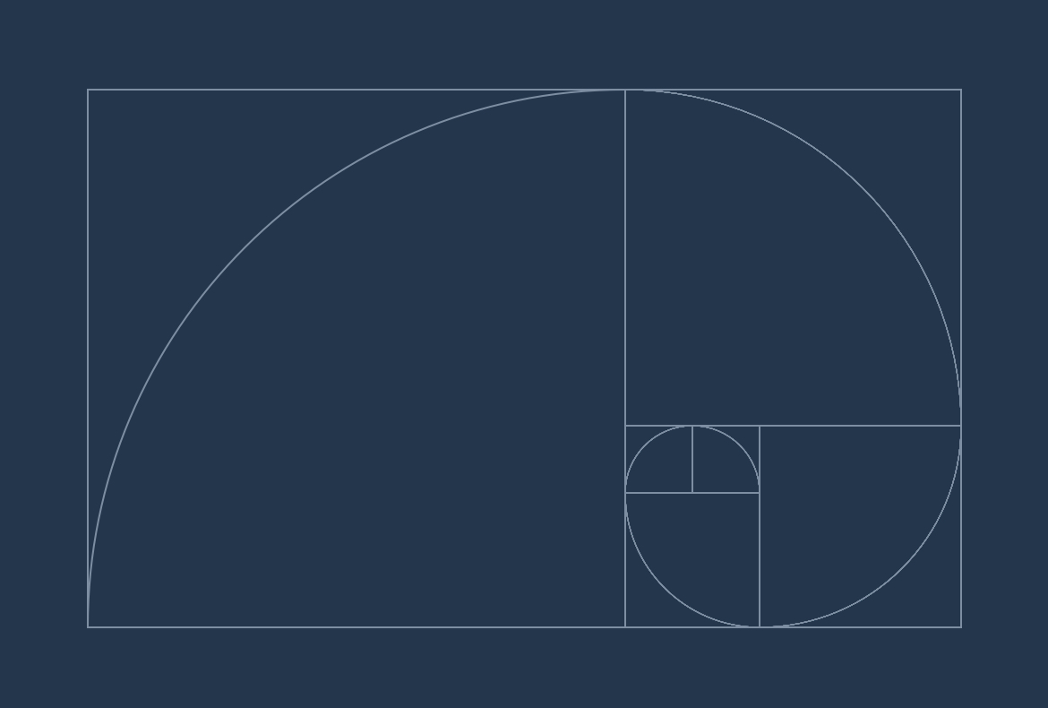
Nowadays the Golden Ratio is often used in UI Design because it brings balance in the web and mobile user interfaces.
So I decided to use a Golden Ration grid as a starting point to design the new case study. I reviewed the copy given in a google document and split into sections.
After a few low fidelity sketches, then I mockup up a final prototype in Axure to test it with the marketing team to check if the storytelling flow was working as intended.
Once the copy was signed-off, I was able to start working on the interface layout.
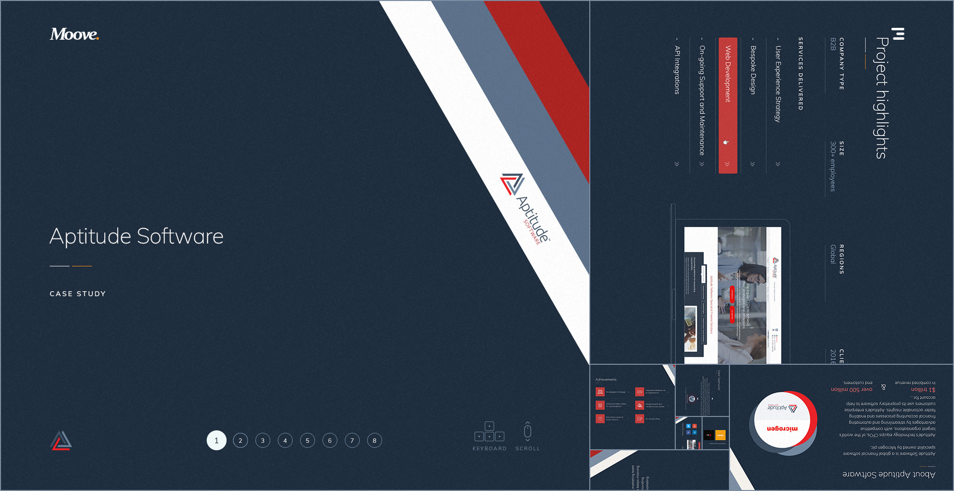
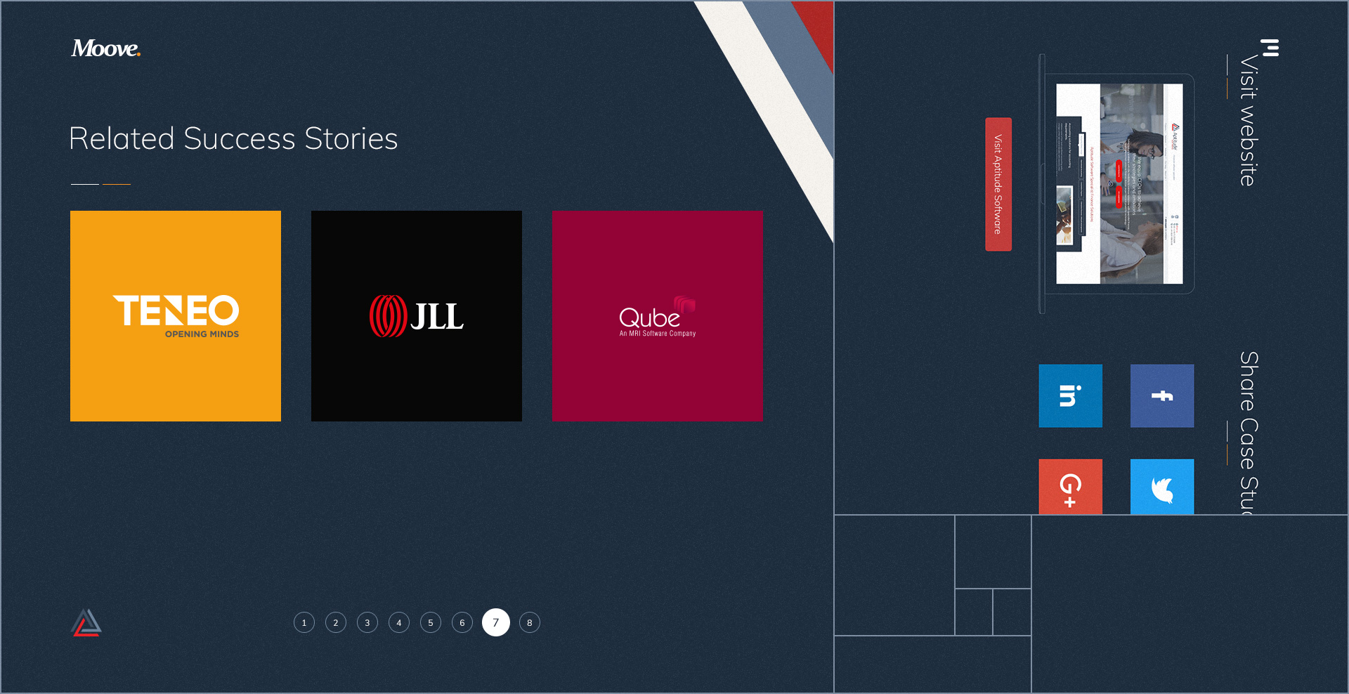
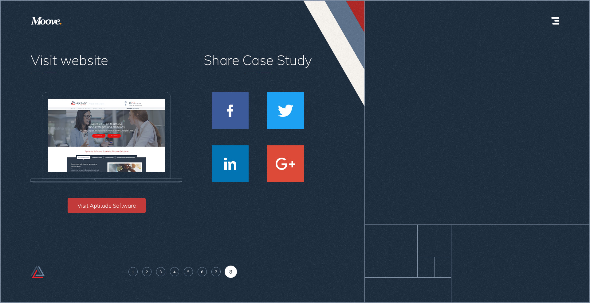
The site has 8 screens and it includes the following content:
- Intro screen
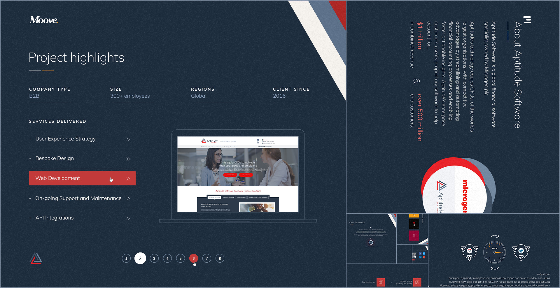
- Project Highlights
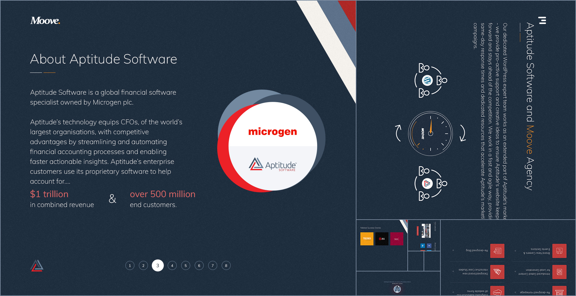
- Info about the client
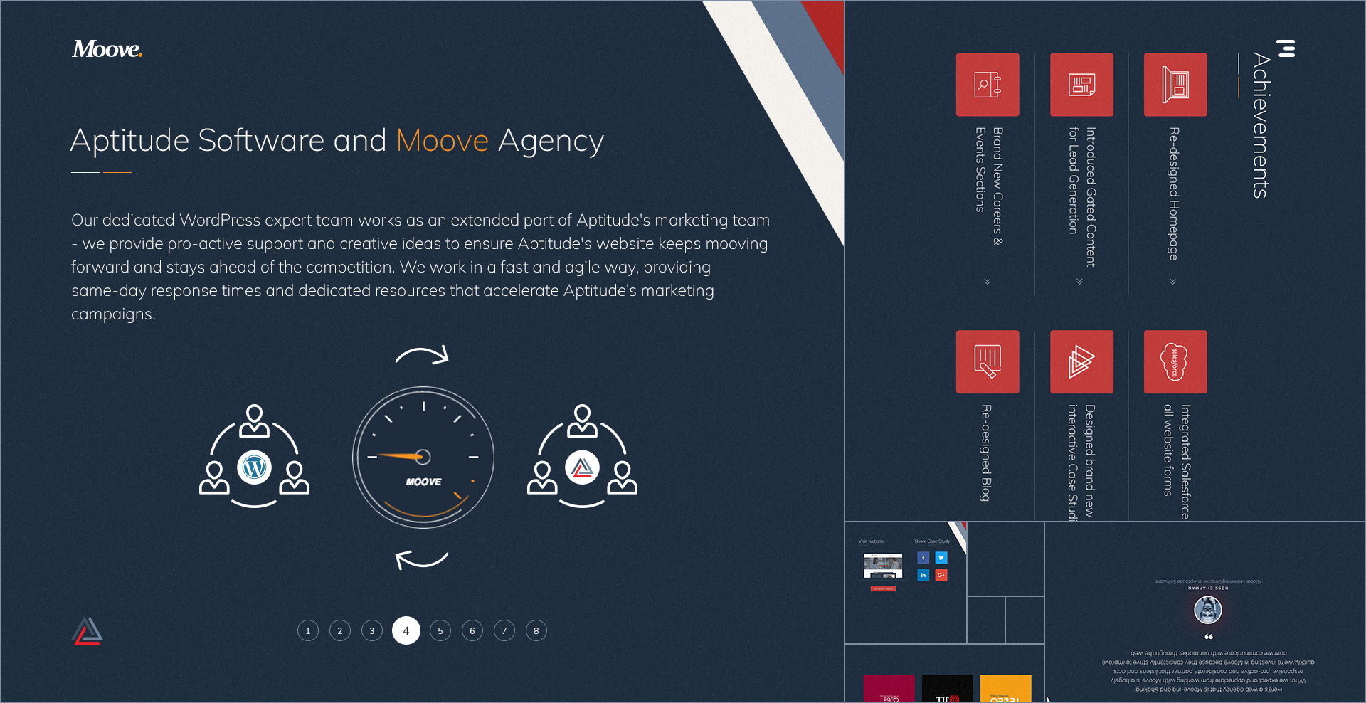
- The collaboration between the agency and the client
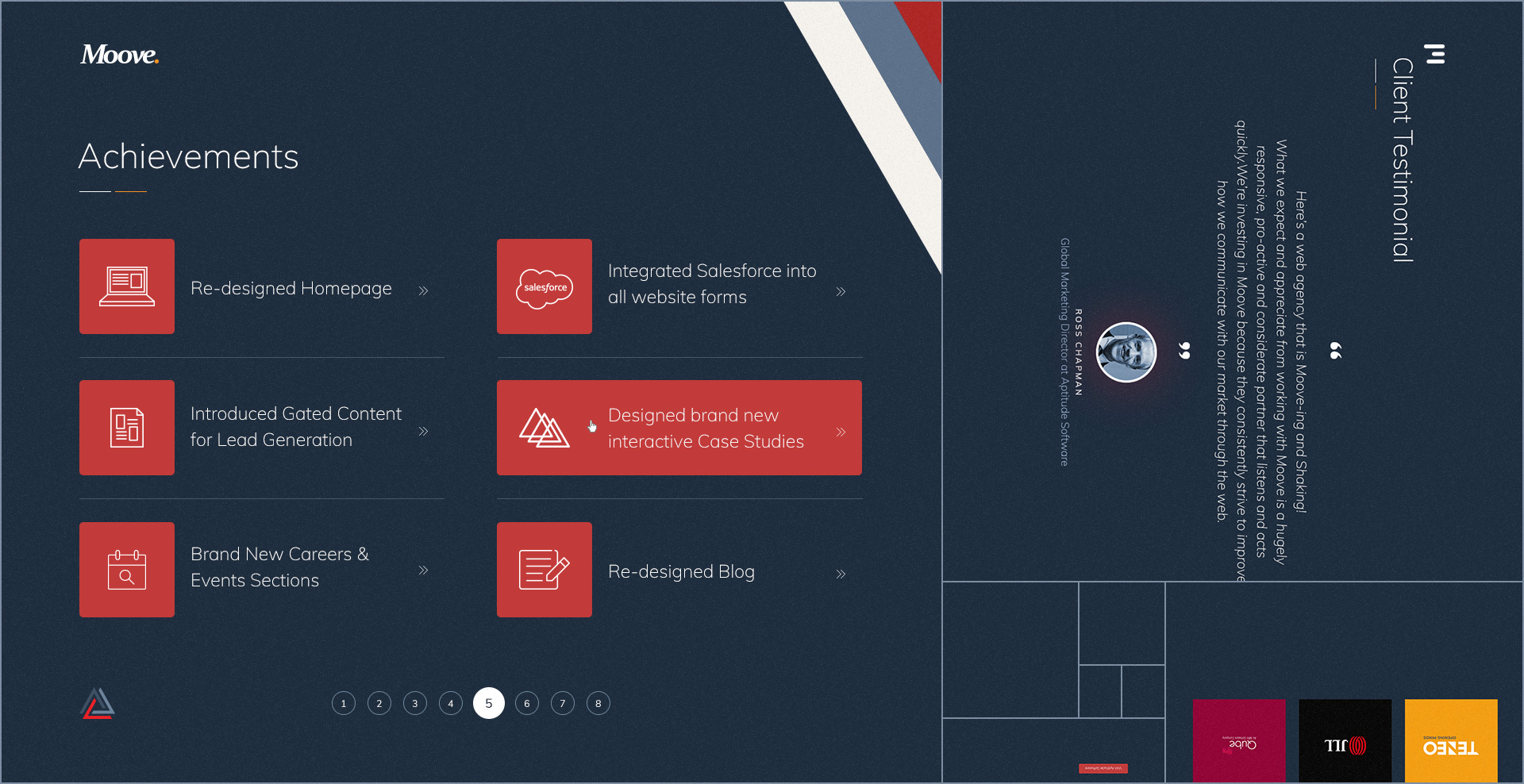
- Achievements
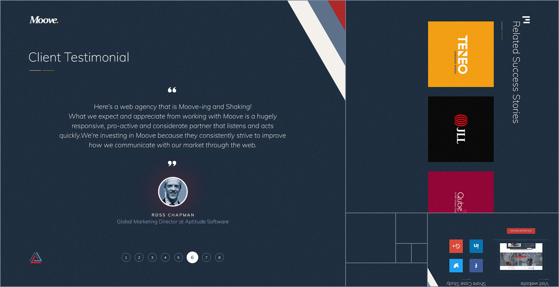
- Client's Testimonial
- Related case studies
- Final screen with links to the live site and social media sharing CTA's
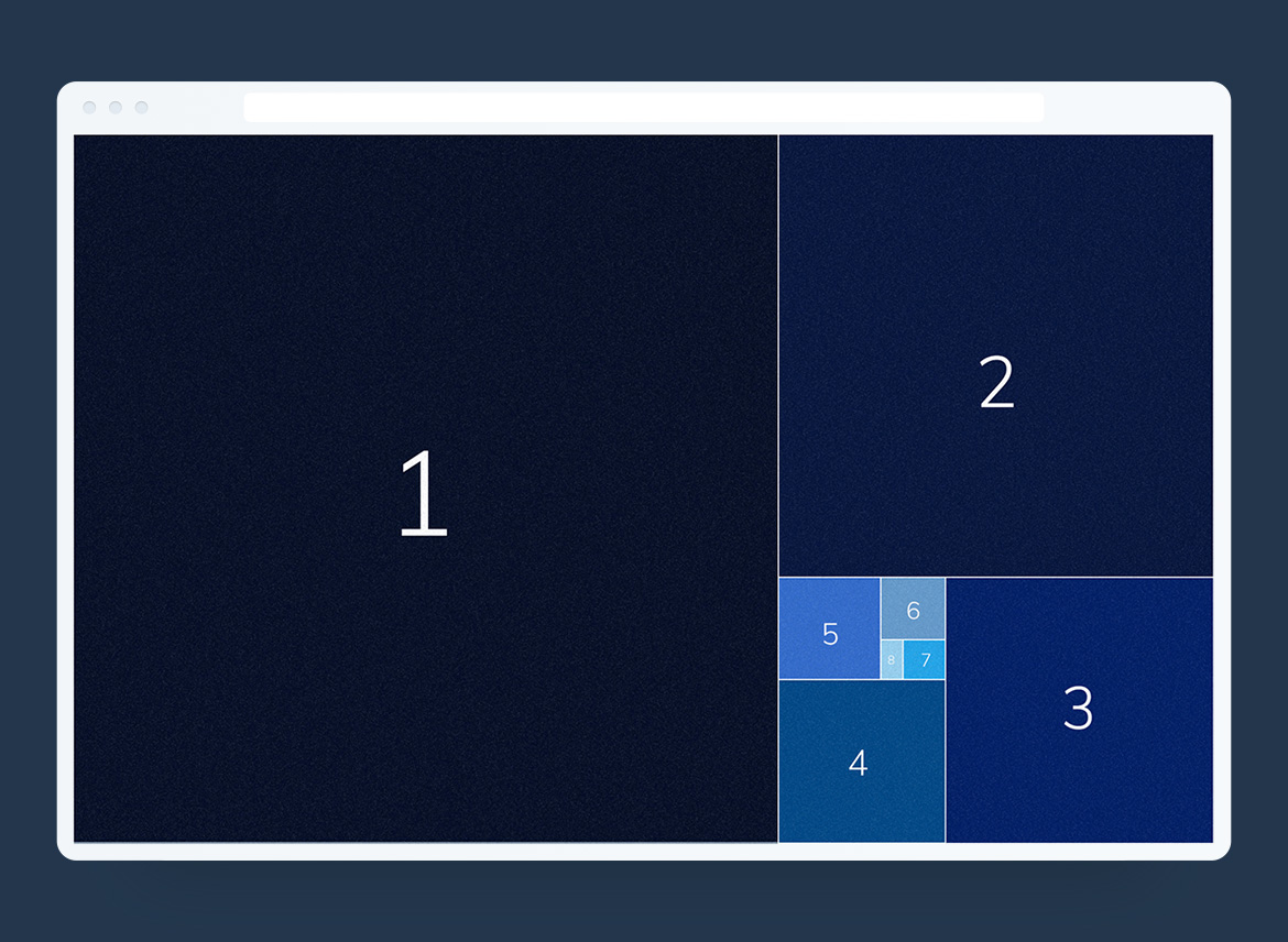
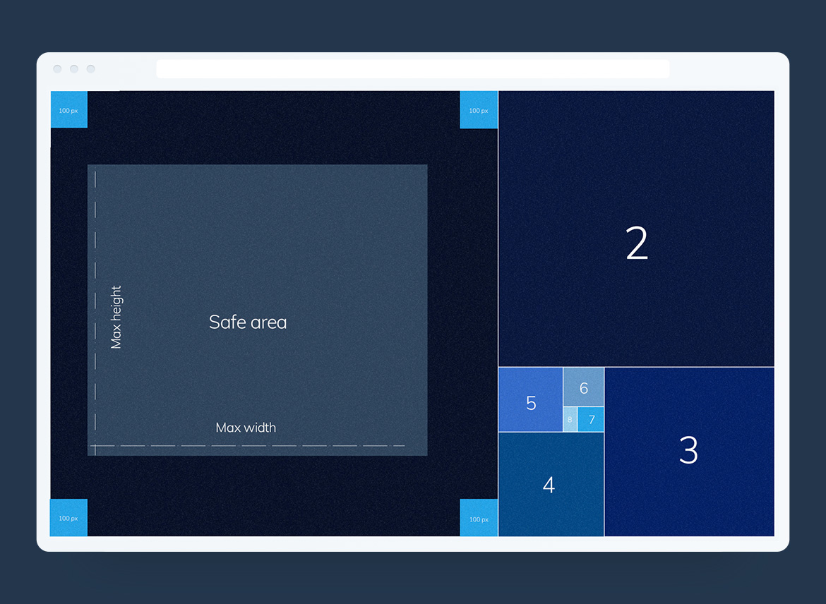
Working on the UI layout.
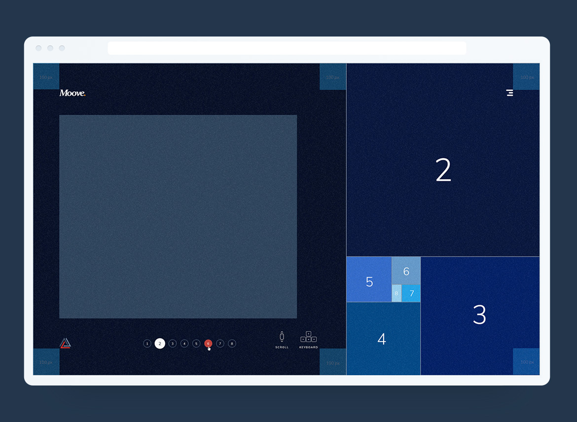
After a few iterations, I have identified the maximum width and height of the safe area. This is the space where the graphics and the copy will appear. I set it up also the global padding of the active slide to guarantee white space around the content.
Global elements of the web user interface:
Top area
- the Moove logo
- burger icon to open the Moove menu
Bottom area
- the client logo (bottom left)
- the pagination triggers to switch between the slides (bottom centre)
- arrows keys + mouse scroll icons which appear only the first slide and suggest t the users how to use the UI (bottom right)
To improve the user experience, I add the possibility to control the interface through the arrows keys and the mouse scroll feature.
UI motion consistency.
To ensure consistency across the user interface when switching between the sections, I decided to apply the same movement to the diagonal stripes and headlines for all the slides. The headline and the colourful stripes move from right to left.
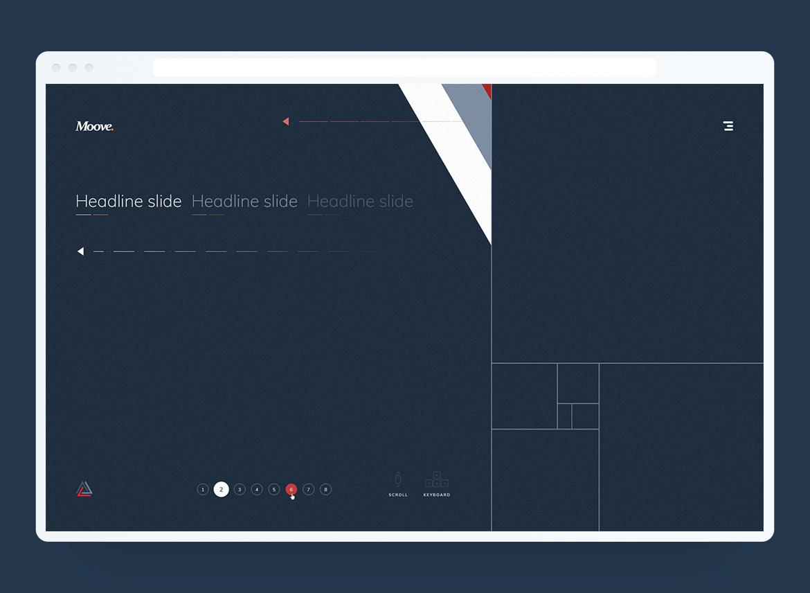
Then I started to design all the visuals for each slide and think of the UI animations.
The idea was to create a bespoke visual for each slide and add a subtle animation (on load) to give more context to the copy.
Click on the thumbnail above to see the full pixel...
Click on the thumbnail above to see the full pixel...
Developers handover.
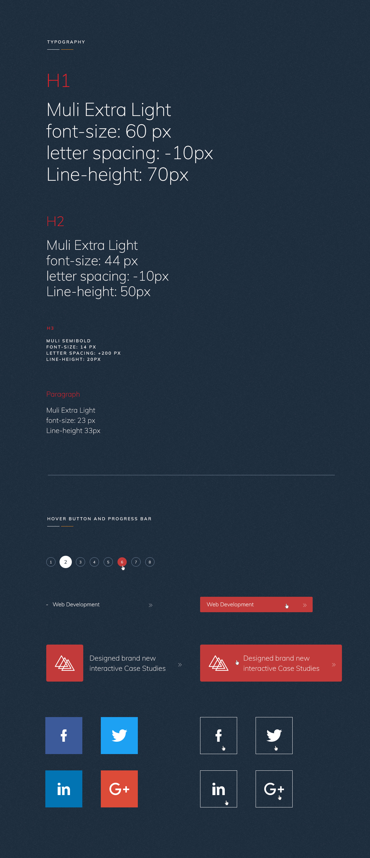
Lastly, I have created the style guide, technical documentation and UI animation docs for the front-end developers.
Developers handover.
Lastly, I have created the style guide, technical documentation and UI animation docs for the front-end developers.
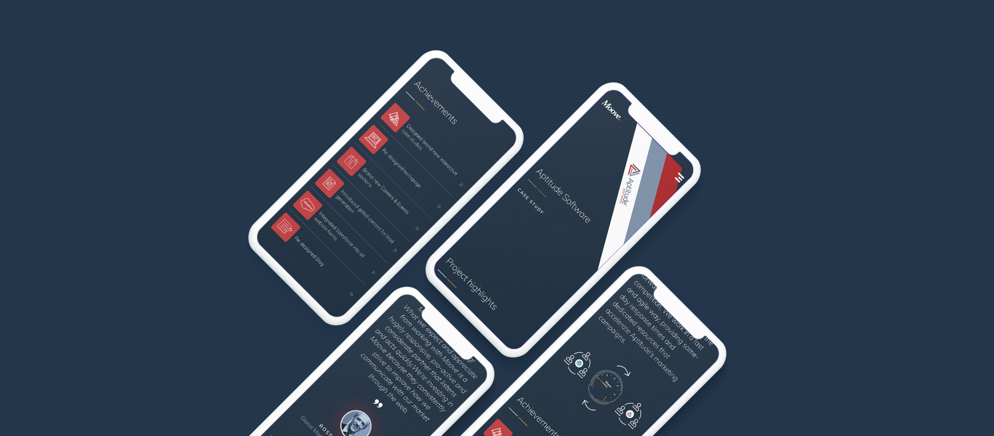
Mobile Experience.
The mobile version of the case study works only with the portrait view and it use a vertical scroll to enhance better and smooth user experience.
⋮
⋮