PRODUCT DESIGN
CharityJob
CharityJob
Helping young professionals to find courses
Helping young professionals to find courses
The platfom helps young professionals to find well-qualified courses, so they can improve their skills a proceed with a career development path.
The courses platform is one of the services that CharityJob offers to its audience. CharityJob is the UK's number one recruiting site: it connects not-for-profit organizations with the most passionate candidates in the charity sector.
The platform is targeted to aged mid 20s - early 30s young professionals. Persona: course finder.
MY ROLE & TEAM
My role as designer was to set a design and usability direction for a seamless mobile and desktop user experience.
RESPONSIBILITIES
Gather requirements
- Conduct user testing sessions and interviews
- Analysis of competitors product features
Produce user flows, sitemap and low-fidelity wireframes (Balsamiq)
Liaise with developers to discuss opportunities and constraints
Present prototypes (Balsamiq & Sketch/InVision) to client stakeholders for internal validation
Create final visual designs (Sketch)
Design handofft to developers
I joined the client product team assigned to this project and worked alongside with a product manager, a software engineer and a front-end developer.
AUDIENCE
The platform is targeted to aged mid 20s - early 30s young professionals. They want to improve their skills to pursue a career in the charity sector.
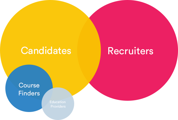
CharityJob four persona. Candidates, Recruiters, Course Finders, Education Providers.
They are looking to specialised courses to gain professional certifications and qualifications. The "course finder" persona is a segment of the “candidate” persona. Education course provider is a secondary persona of the courses product. The client provided the info about the product Persona created with previous internal UX research.
STAKEHOLDERS INTERVIEWS
Understanding the business requirements and defining the project KPI's.
The project started with a kick-off meeting with the client stakeholders. I interviewed them to understand more about the business strategy, what was not working and want they want to achieve. The new course finder needs to generate more traffic, so the sales team can pitch convincing stats to potential courses education providers and start offering also paid ads.
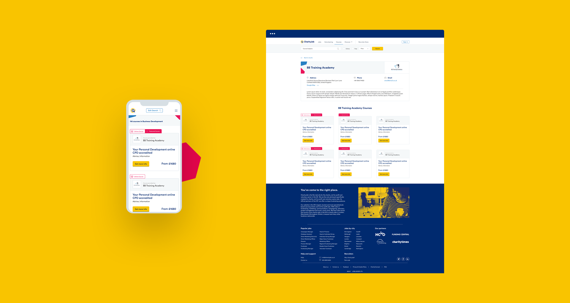
As part of the new business strategy, the client asked to design a new template: the education profile page which will display all the available provider courses.
Short term goals (6 mothns):
Increase total page views - Increase views per single course
Long term goals (1 year):
Increase clicks on “Book a course” CTA.
Mobile First
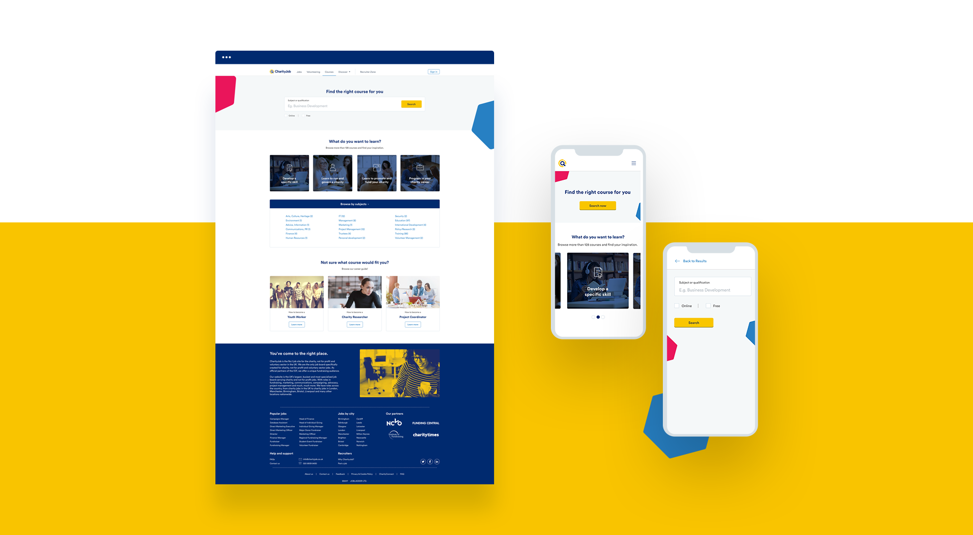
Statistics reveal that 60% of the traffic comes from mobile devices, but the product is not well optimized for mobile phones. For this reason, I decided to take a mobile-first approach for the project.
Visual Design Consistency
The client asked to re-design not only the user experience but also the visual aspect of the product since the look & feel was inconsistent with the other online CharityJob products.
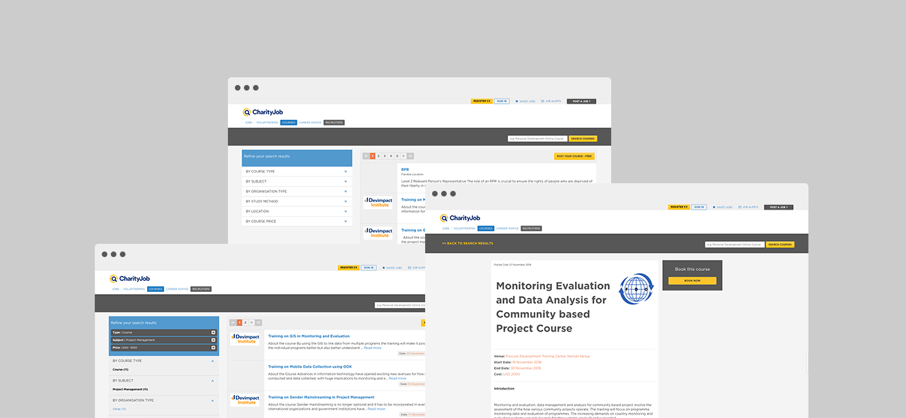
Old course finder product: results page and course detail page.
USER INTERVIEWS
I conducted semi-structured interviews to learn how the course finders feel about seeking for a course and what they need.
How they search
They might use a standard search box as a starting point if they believe to know exactly what they want (specific course). They find useful thoose websites where they can select a topic to narrow down the results. It is helpful in case the first approach fails, or they are not sure what they are looking for.
What they need and want
They are sensitive to cost because they hold junior roles or work part-time. For this reason, free courses are very welcome. If they decide to attend in-class courses, they said to prefer more short courses (3-5 days) than long courses spanning over 2-3 months. Since they have a busy life, e-learning or online courses are appreciate because this gives them more flexibility to schedule the weekly activities.
Pain points
They feel frustrated when the websites show expired courses as results. Some times they think the Course headlines are misleading. They don't like to fill in forms to get more info.
USER TESTING
User testing to evaluate the current experience.
We run five user testing to evaluate the usability of the current product. The users needed to complete three tasks. A short interview followed the user testing to gather more feedback about the overall interface.
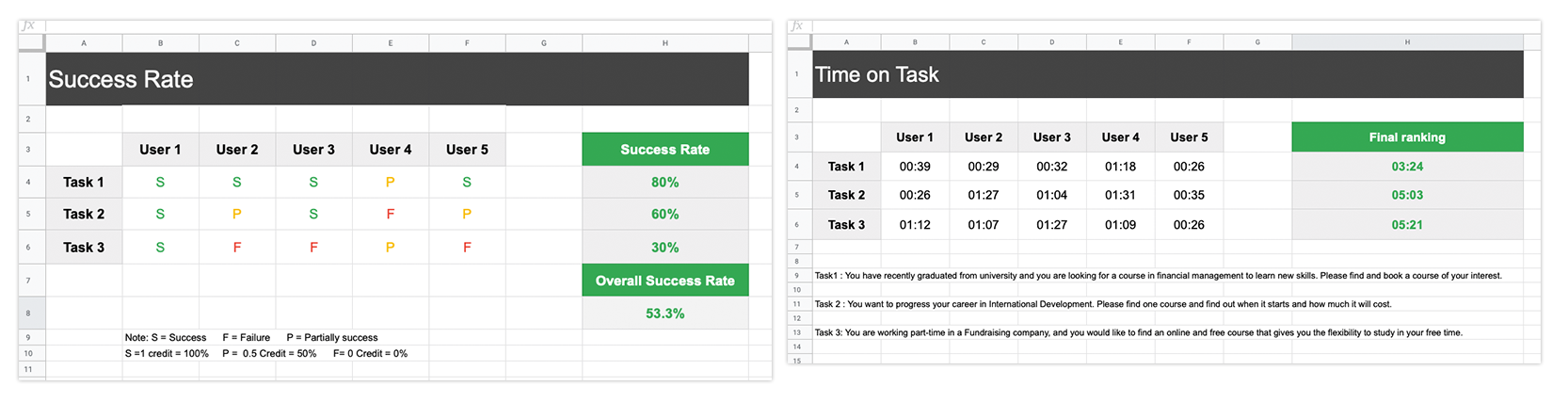
User testing identified several user pain points that became the key areas of focus.
Search box
- The search box is not prominent (2 users were struggling to find it) and distant from the filters panel
- The search doesn't give precise results
- They mentioned a few times they like the "suggested search" of Google
Filters Panel
- It took some time to get familiar with the the accordion menu.
- Online and Free options are challenging to find
- Course type, organisation type, study method are not considered important options
Listing Results
- Start/end dates are very appreciated
ANALYSIS & SOLUTIONS
I analysed the qualitative data, and I started looking for solutions to design the new user experience.
Ideas
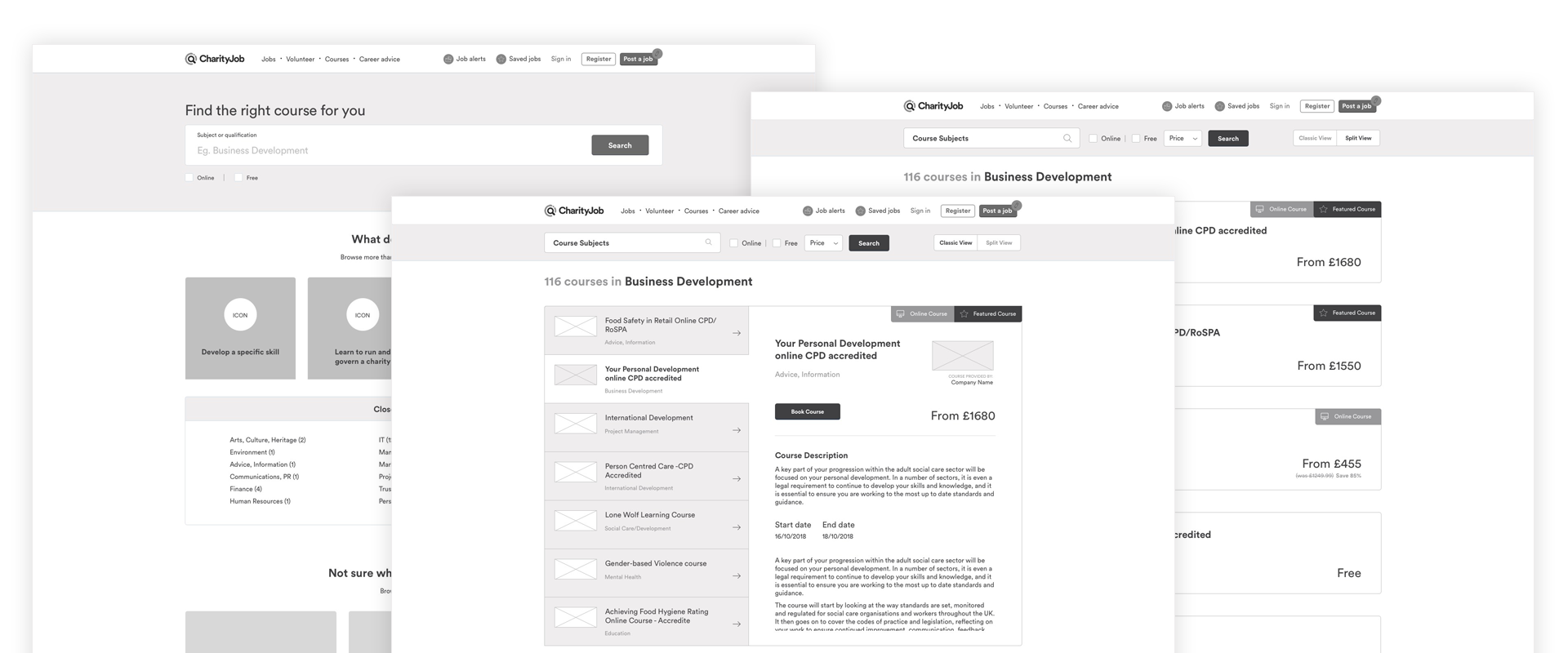
What if we explore a new layout design (desktop) for the results page and introduce a new template (homepage) as a starting point of the user experience?
Some of the top recruiting sites (Linkedin, Indeed, Glassdoor, Google for jobs, Simply Hired) use the two-panels layout. The interface allows users to quickly see the job details without having to open a new job tab or move back and forth.
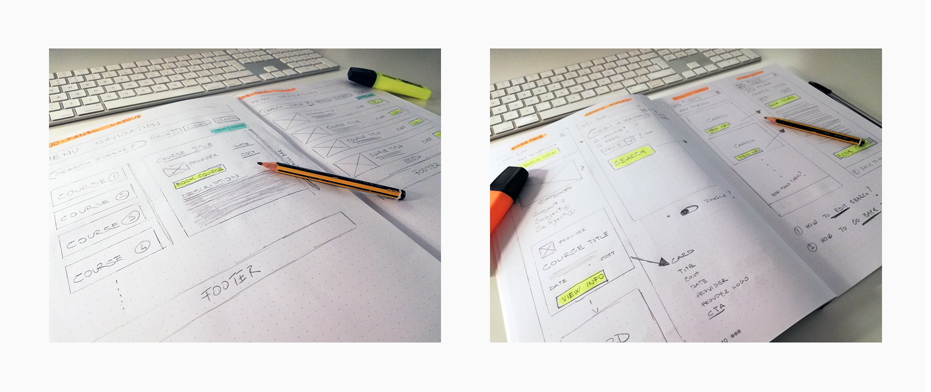
Paper Sketching to explore ideas
Wireframing to test solutions
I decided to present this idea to the stakeholders and test it with the users. Since it could be risky to change the UI significantly, I wanted to keep also the one-panel layout. There will be a button to swtich between the list view and two panel layout. I used Balsamiq to create clickable PDF prototypes for the testing and to show the new user flows.
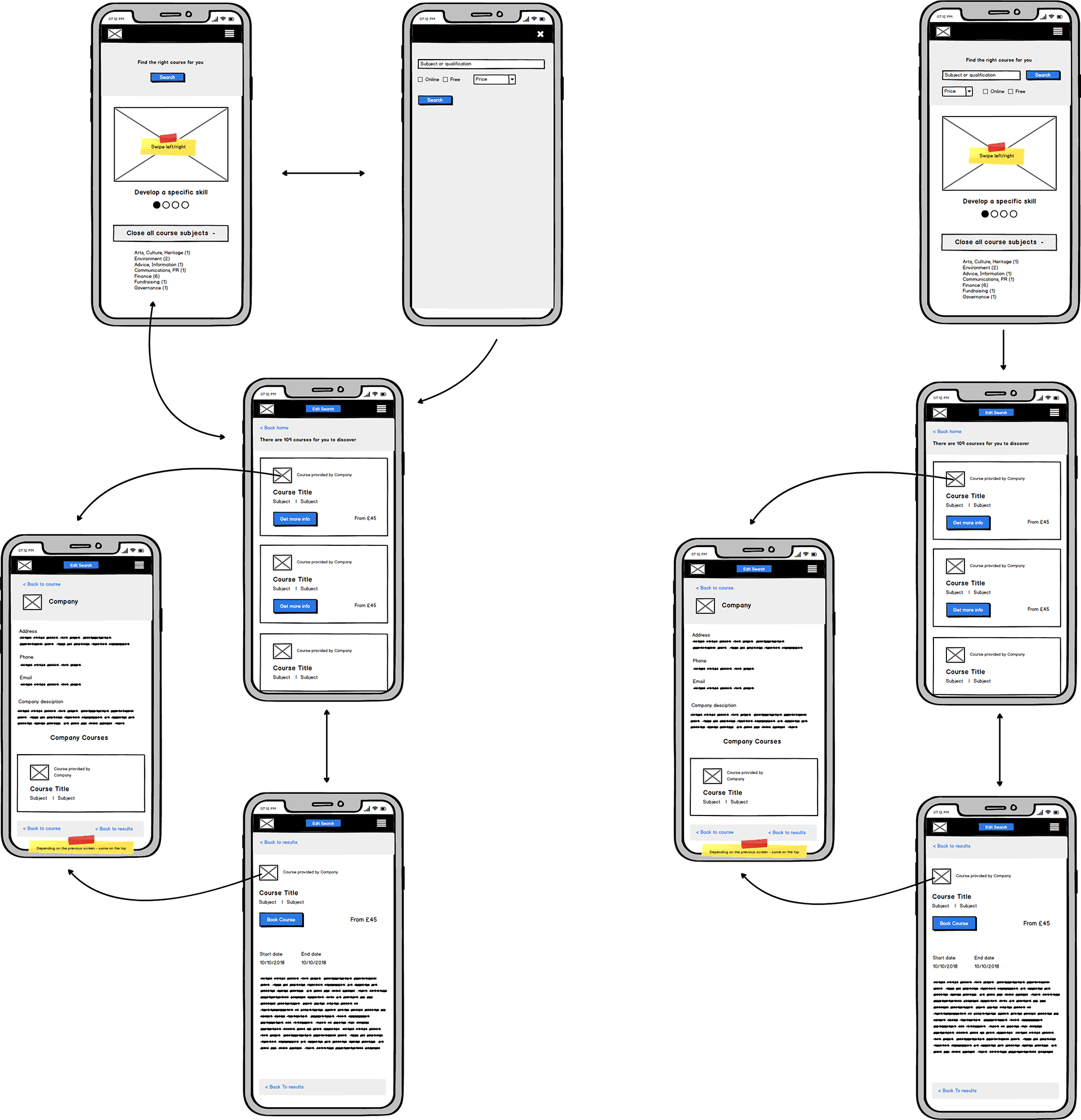
Mobile user flows. Card based layout. Screen interactions.
Presenting ideas to stakeholders and checking feasibility with developers
I presented the prototype to explain the new user flows and layout to the stakeholders. We agree using a pagination system in the left panel instead of the scrollbar to reduce the implementation and testing time. The were excited about the two-panel layout.
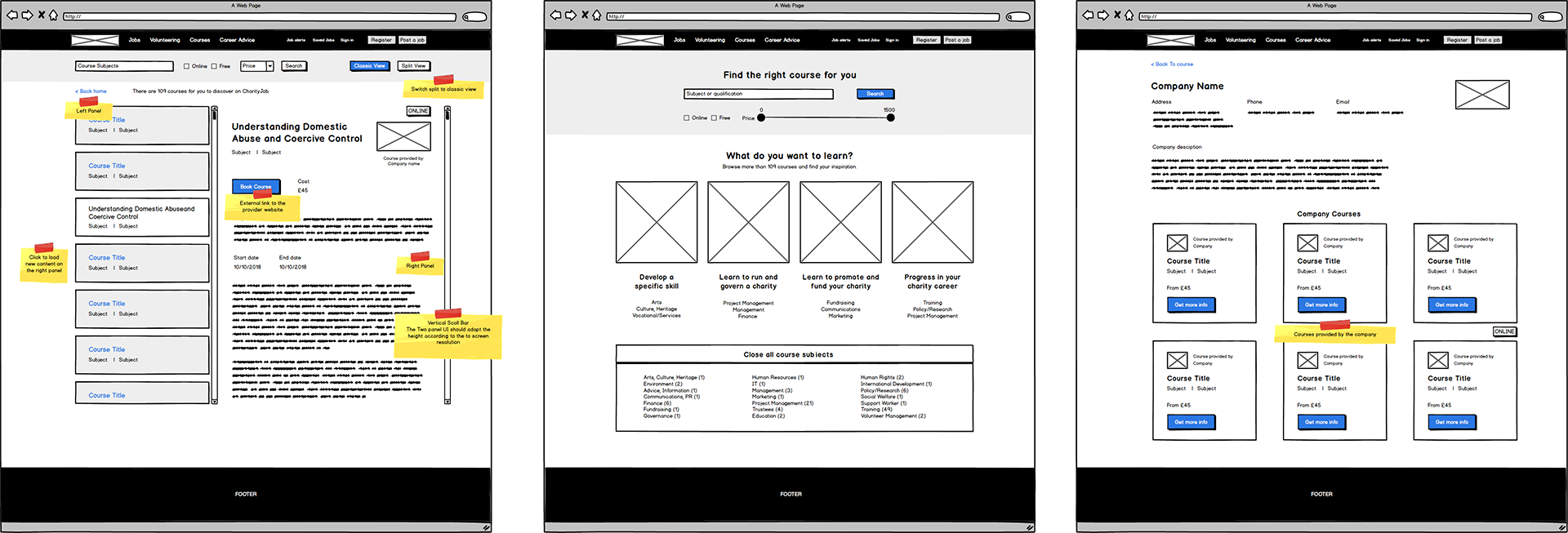
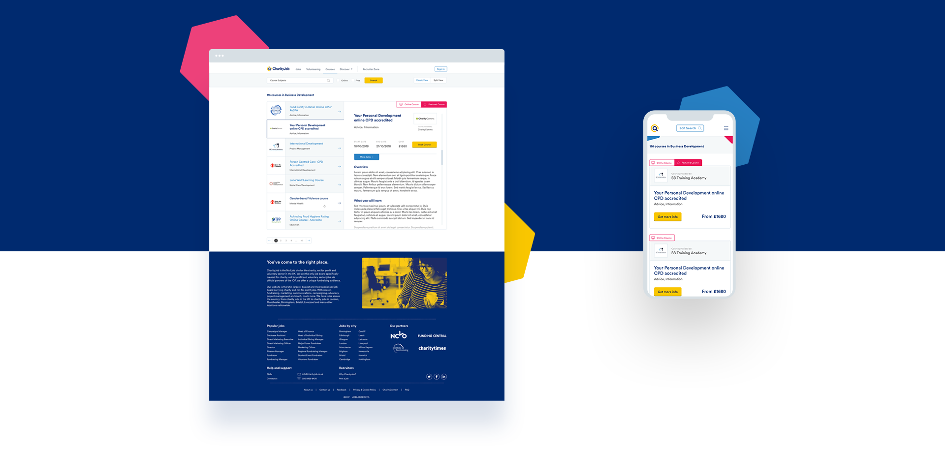
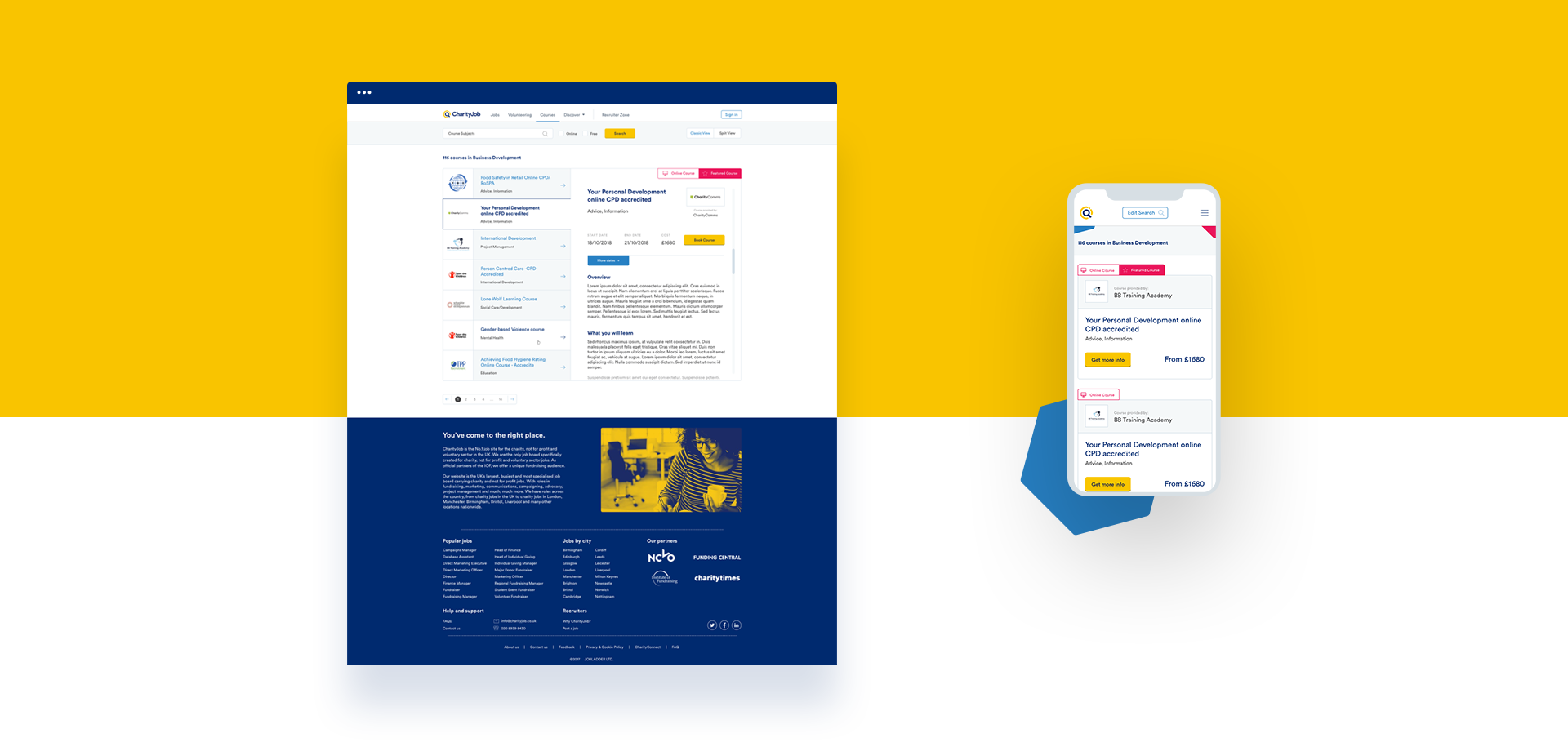
Two-panel layout (new template)
Homepage (new template)
Education Provider (new template)
Getting first user feedback about the new interface
We showed the new interface to the users and we gathered the first feedback:
- They find useful having a prominent search bar on the top of the page.
- The price drop-down was understood better than the price slider UI.
- The subjects links on the homepage but they din't understand why there are repetitive links on the homepage.
- The users appreciated having the full course details on the right panel.
Sketch prototype and inVision to user testing
Iterating and final user testing
Since there was a limited time, I worked on the next design iteration using Sketch to create medium-fidelity prototypes. We tested the prototype through inVision. After another round of user testing, feedback and small adjustments, I moved on the visual interface design phase.
VISUAL DESIGN
I created the UI components, a style guide and built the templates with Sketch.
The final handover meeting to front-end developer and software engineer was the last step of my responsibilities of this project. A final user testing happened when the product was implemented after a couple of months.
RESULTS & LESSON LEARNED
The client launched the new product in January 2019, and the traffic increased significantly after it went live!
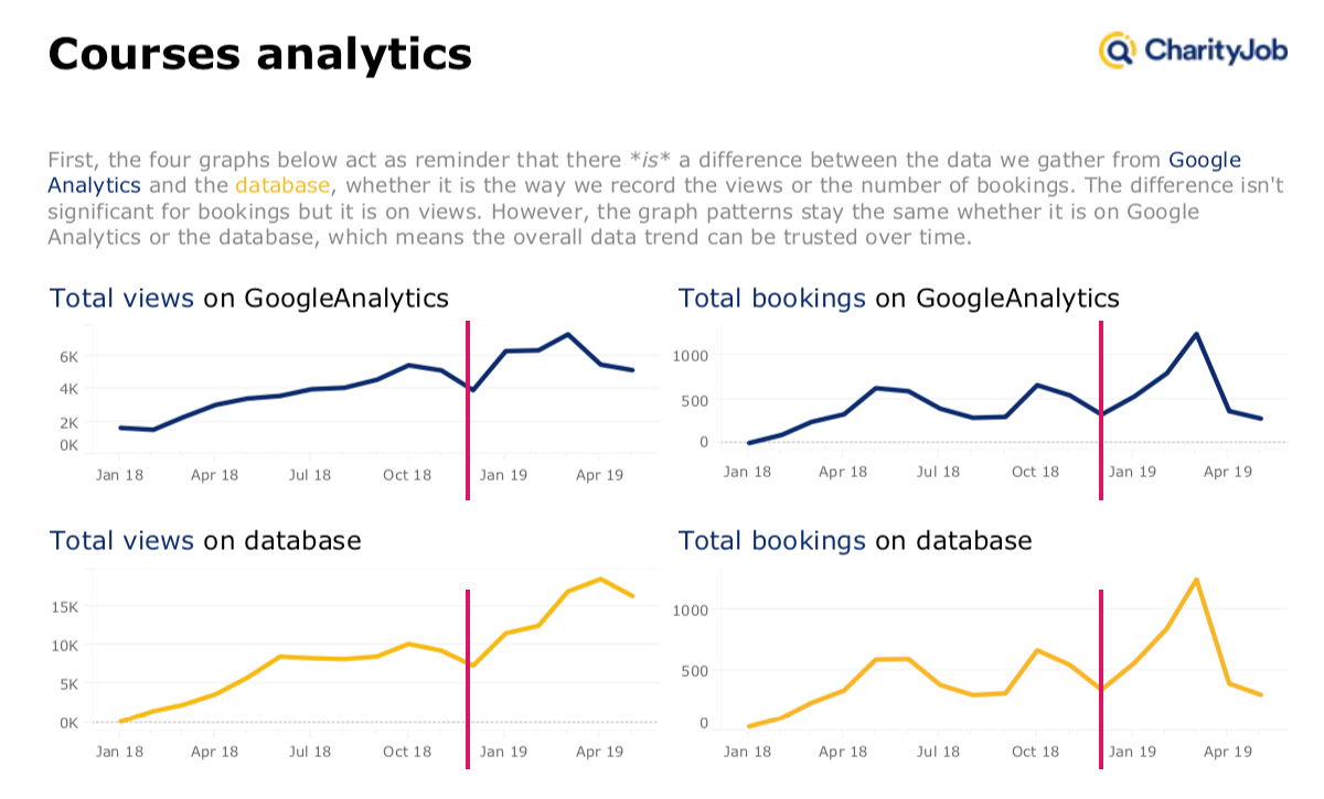
Total Views - Total Bookings
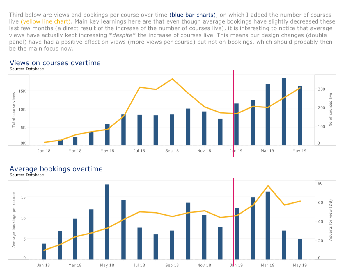
Views on Courses - Click on Bookings
The new design had a significant impact on increasing the total traffic on the site and a positive effect on views per course. However, the clicks on bookings didn't increase much. So it will be the main focus to work on.
Total views increased by 45% after four months launch
Course page views increased by 35% after four months launch