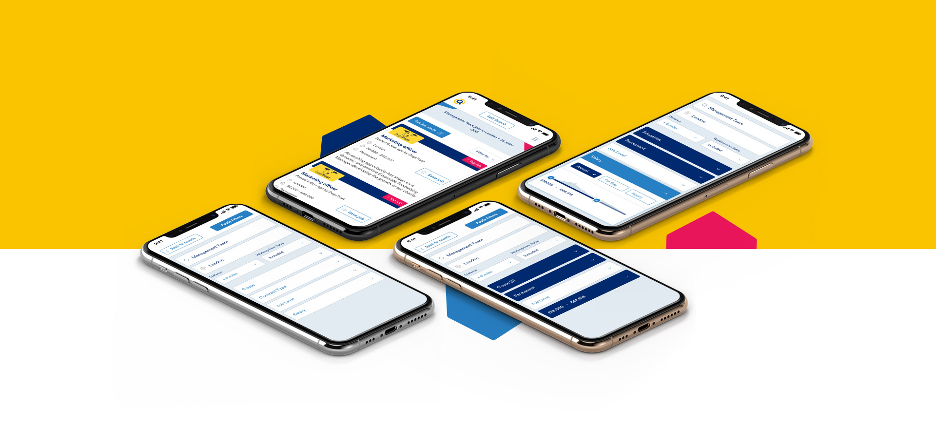
SEARCH / FILTERS UI
SEARCH / FILTERS UI
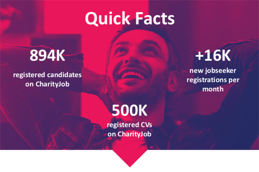
CharityJob
CharityJob
Improving the search job experience
Improving the search job experience
CLIENT
CharityJob
SECTOR
Charity / Recruitment
YEAR
2018
CharityJob is the only job board specifically created for charity, not for profit, third sector and voluntary jobs.

PROJECT GOALS
Redesign the search boxes and filters in order to:
- Reduce the amount of time a candidate has to spend searching before they find a job they want to apply for
- Make it easy for someone coming back to continue their search and see new jobs
- Create a seamless user experience across desktop and mobile (mobile makes up 50% of the traffic)
As part of project commitment, I have been asked to explore solutions for the UI components and page layout. New insights and opportunities will be evaluated based on budget, resources and time during the ideation phase and before usere testing.
TEAM AND MY ROLE
The core team consisted of a product manager, a software engineer, a front-end developer, ux researcher and myself as ux /ui contractor.
Responsibilities:
- Stakeholders inteviews
- User Testing Analysis
- Produce wireframes (Paper Sketches)
- Produce and Present prototypes (InVision) to client's team for internal validation
- Collaborate for user testing plan
- Create final visual designs (Sketch)
- Produce UI Web Style guide for developers (Sketch)
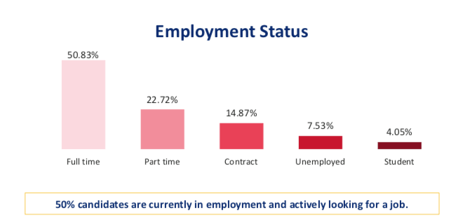
TARGET AUDIENCE
The key users are candidates predominantly based in the UK, and a high percentage are not English citizens.
Candidate Persona:
- Female
- Aged between 25 & 34
- Lives In the South of England looking for jobs mainly in London
- The most popular sector of interest are Finance and Admin
- Degree educated
- 60% are form the charity sector - 40% are from the business sector
- It takes most people 2-3 months to find a new job
CONTEXT
Remote collaboration with UX team and PM.
The client has an internal ux team who run monthly user testing and surveys on the product. We had an intial brainstormimg session on Skype to discuss the objectives of the project and the initial outcomes from the user testing and interviews.
I was given access to the latest user testing session report and quantitative data from a recent survey and google analytcs as well. The client was looking for someone to join the team and help them to:
- Analyse the qualitative and quantitative data
- Identify the critical problems
- Research patterns for a search job experience
- Provide solutions for the new search page layout
- Create the new UI components
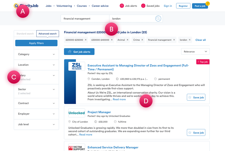
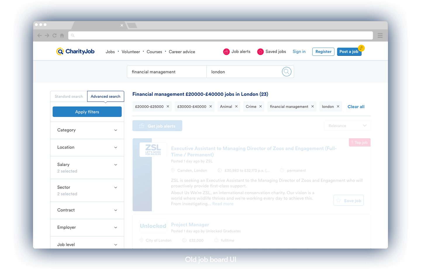
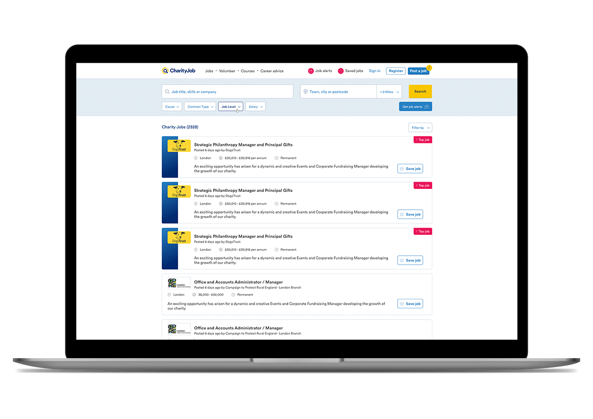
Old page results layout
A Navigation bar - B Search bar & location - C Filters Sidebar - D Jobs Listing Results
PROBLEMS
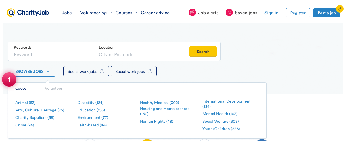
Homapage
1. Location and Cause
Location and Cause are often the first criteria that the userrs use to start the search exprience. "Cause" is labelled "Category" on the page page. So the users get confused and sometimes go back to the homepage to start a new search.
Old search page
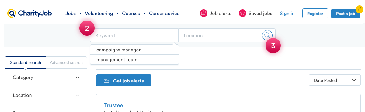
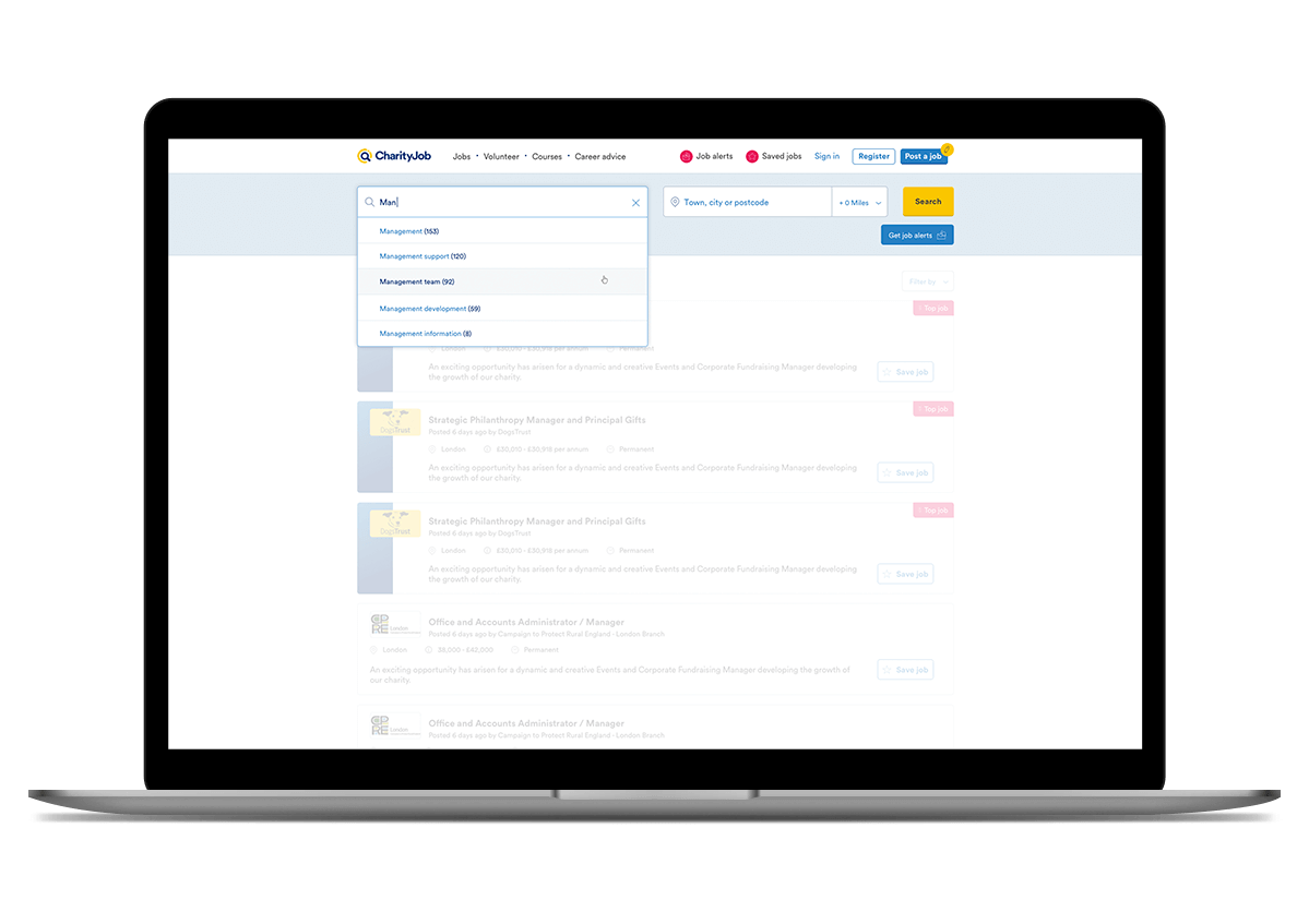
2. Keyword input
- Users would like to see their recent searches because so than they don't need to set the search criteria again when come back to the site. This feature is not available.
- Users often asked why the keyword search doesn't show the suggested/autocomplete keywords when they are typing into the search box like on Google site. They think this a a standard feature of a search input. They have this mental model.
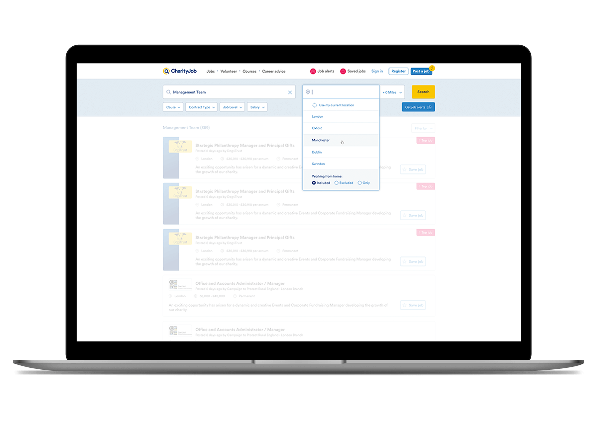
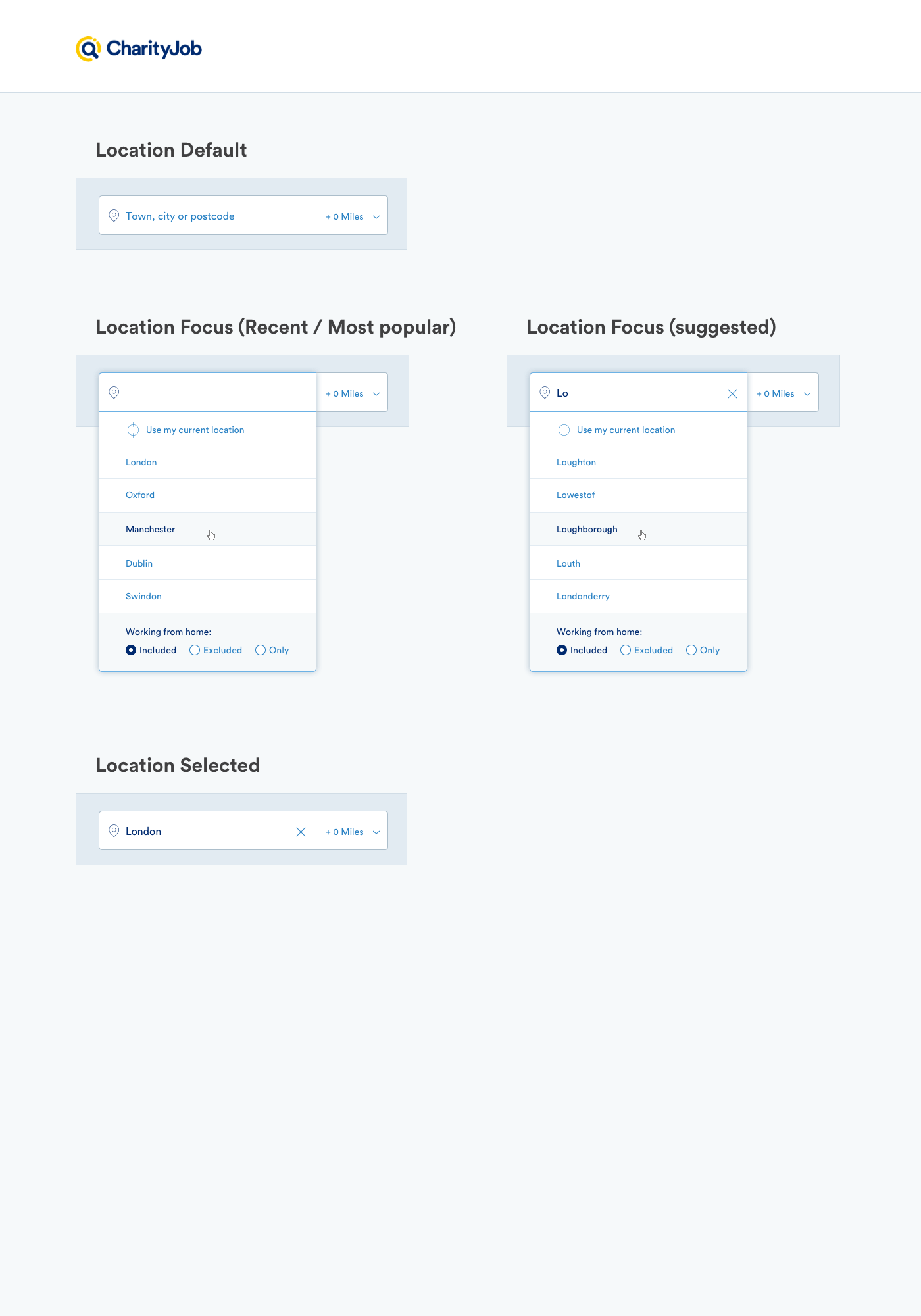
3. Location input
- Location is the first criteria chosen to start a search according to data analysis but it gives not accurate results and neither the possibility to set automatically the current location and miles distance. This features seems to be a common mental model that the users have about a location input for websites
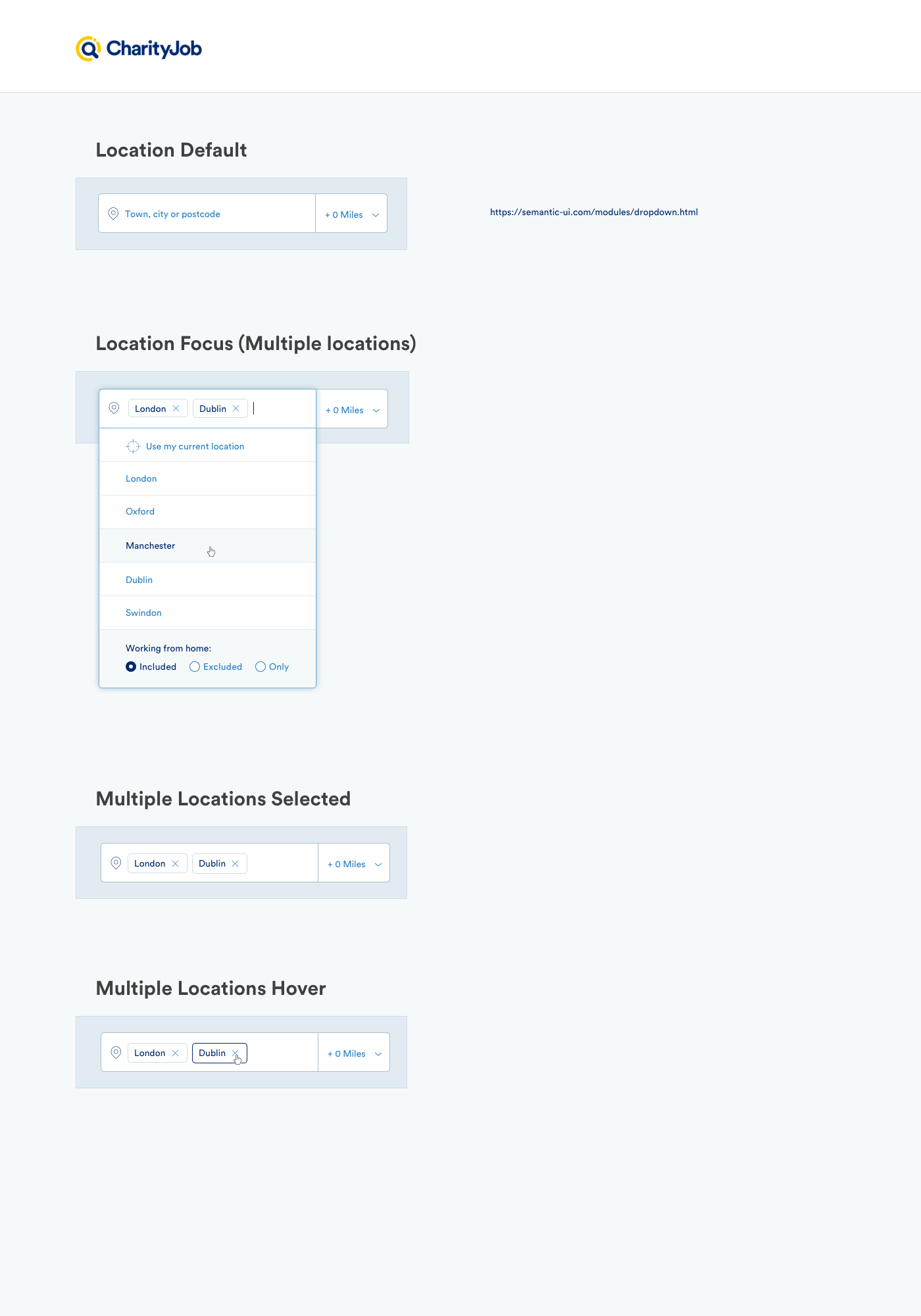
- Users would like to be able to set multiple locations because they need flexibility (eg sometime they search for specific job opportunities and they are willing to relocate for the best job)
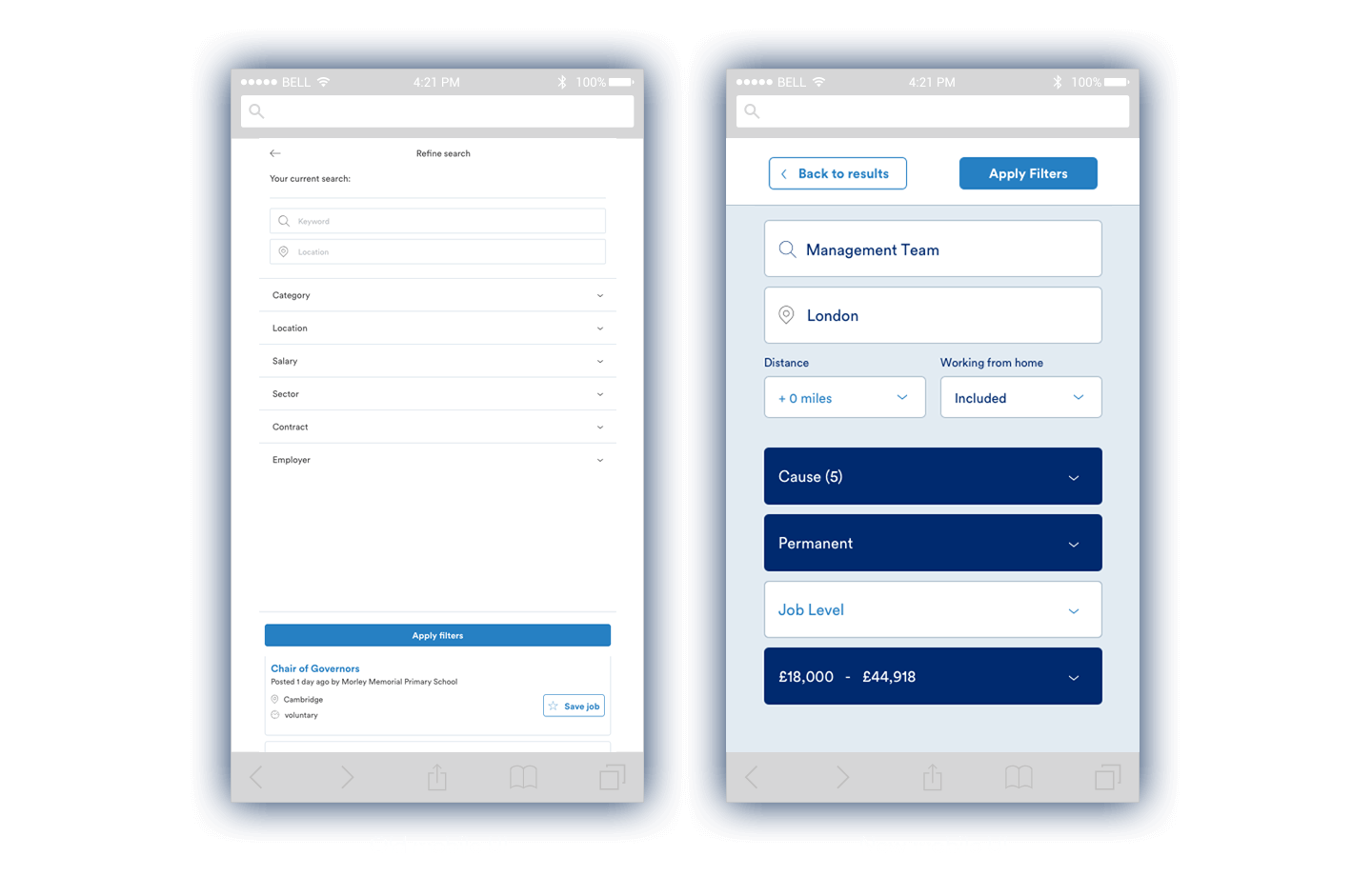
Left filters Panel
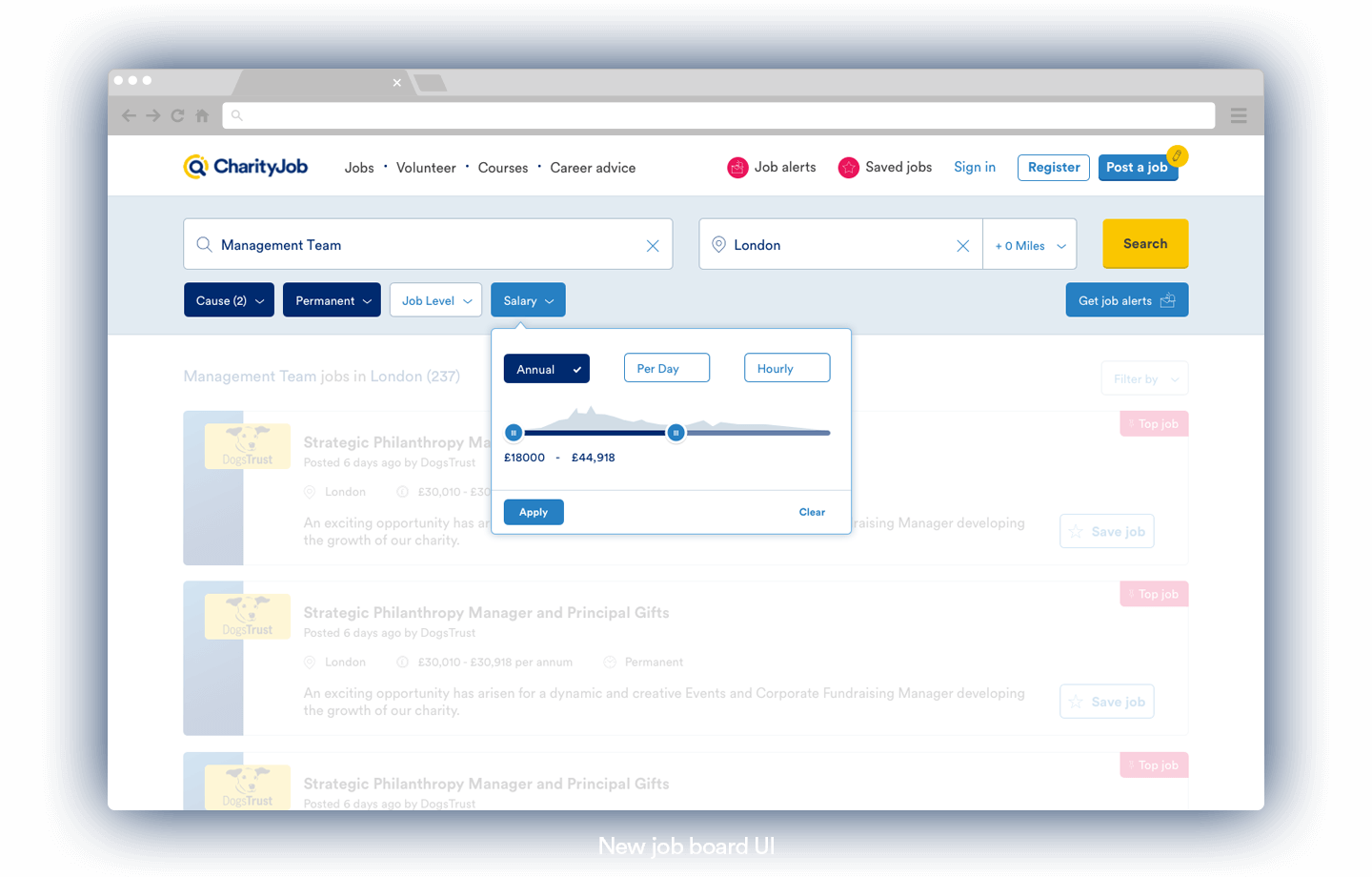
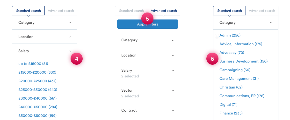
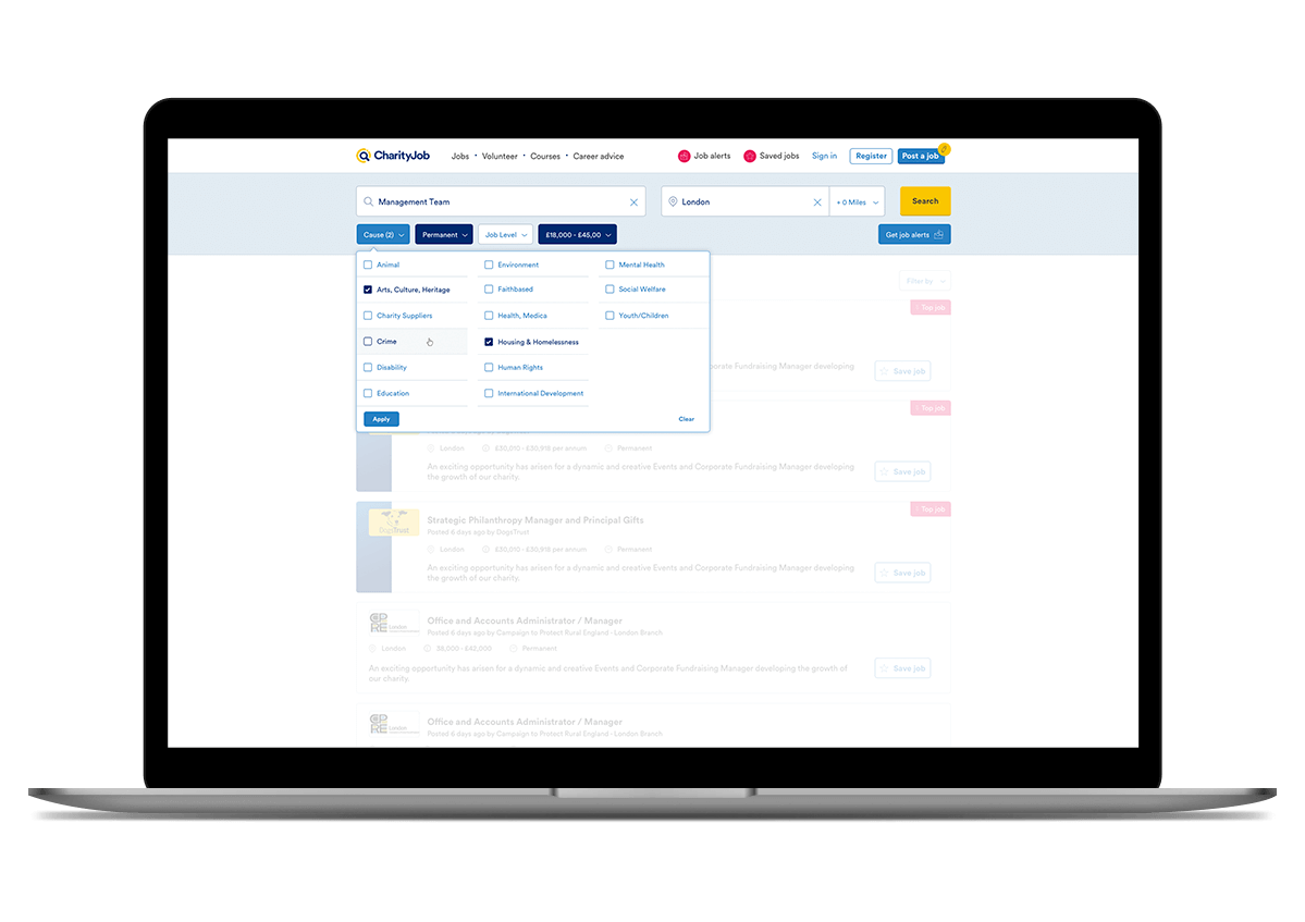
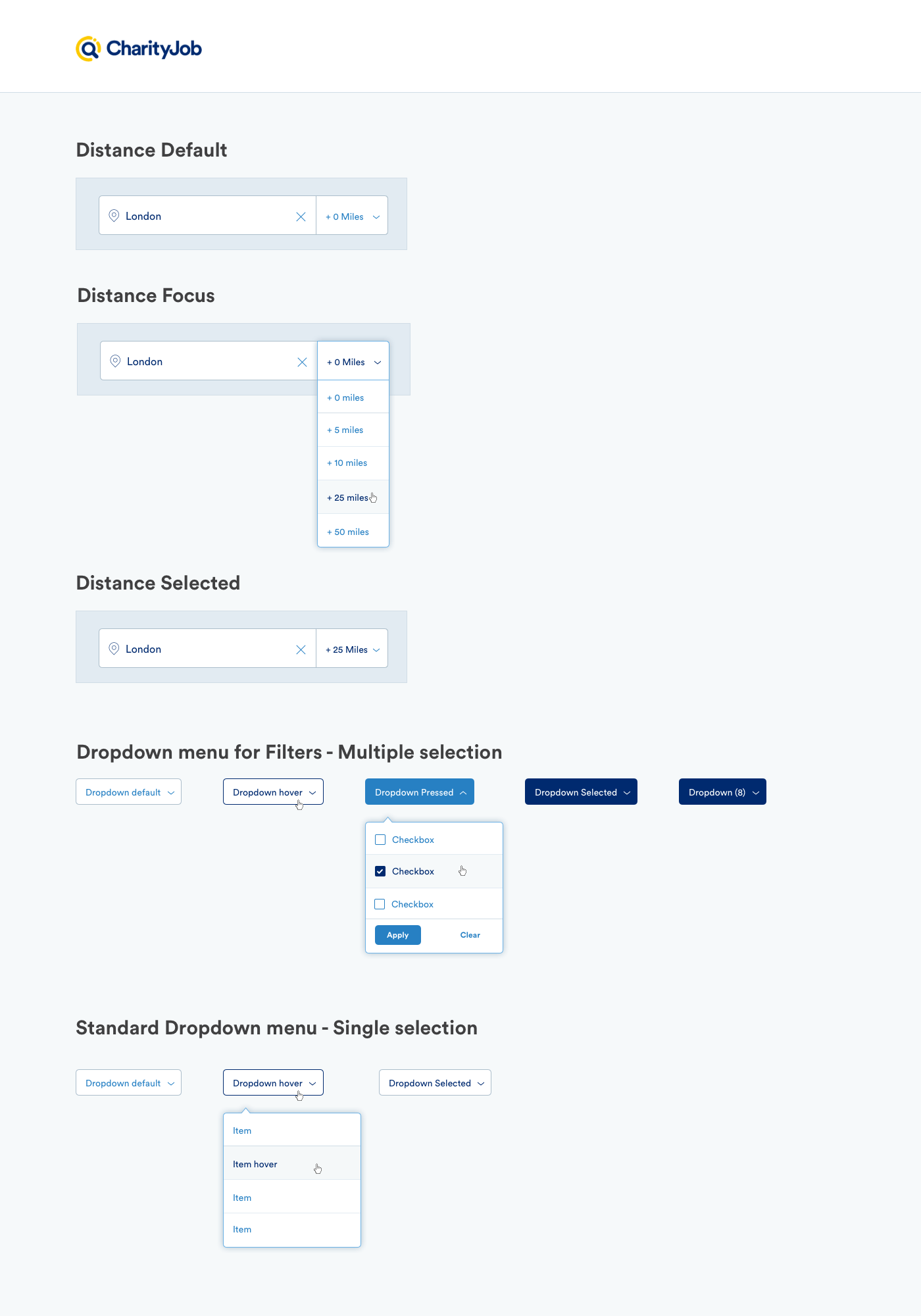
4. Salary Filter
- The salary filter has to narrow selections.
- Users care about minimum salary
They would like to set a minimum value rather than choose salary range
5. Standard vs Advanced
- Users don't understand the difference between standard and advanced search sicne they have idential filtering options.
- It is not straightforward how the filter panel works (accordion menu). Some users were struggling to understand how that works.
6. Category Filter
- Category label create confusions as it is labelled "Cause" on the homepage. So the users sometimes go back to the homepage to start a new search.
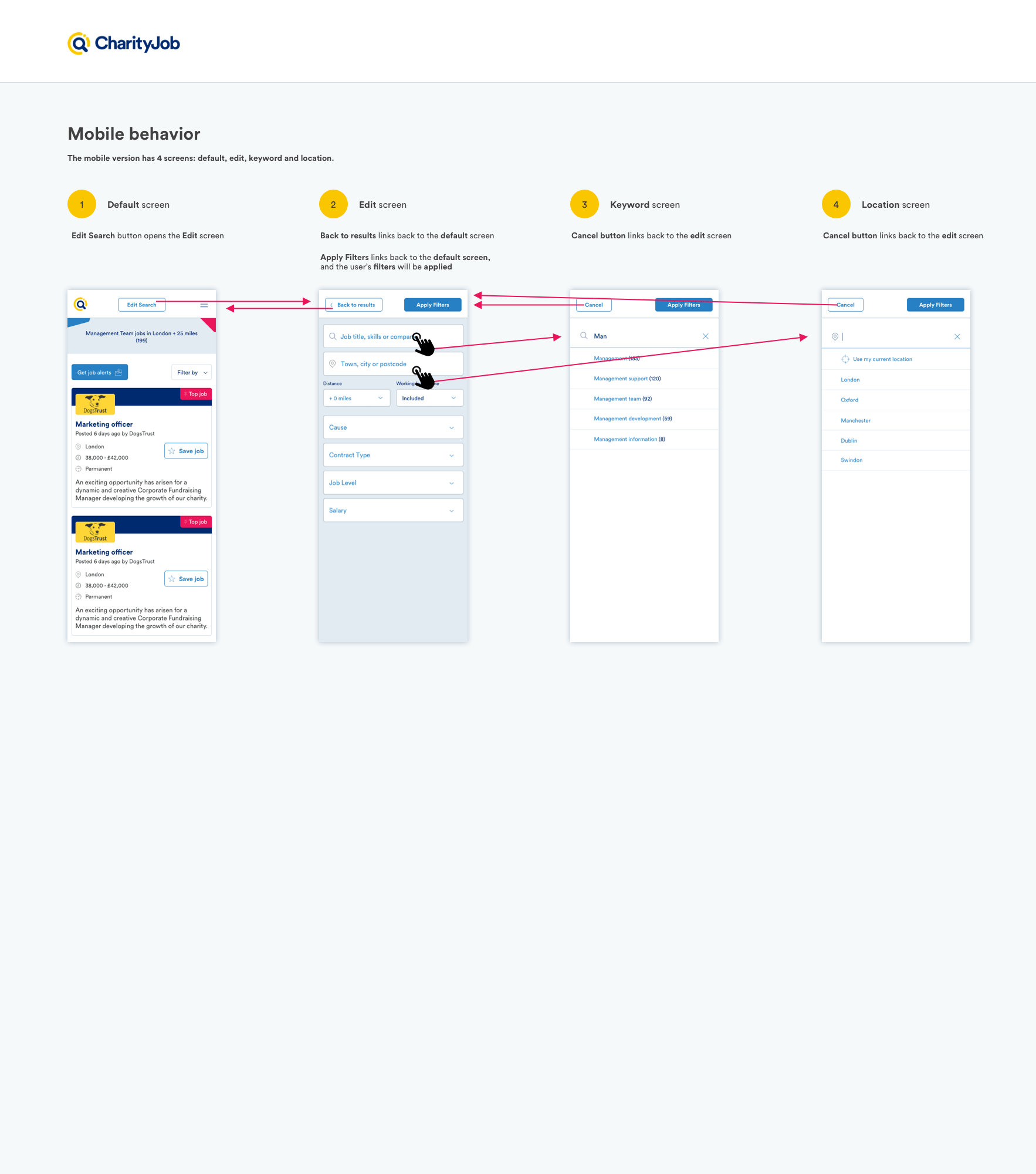
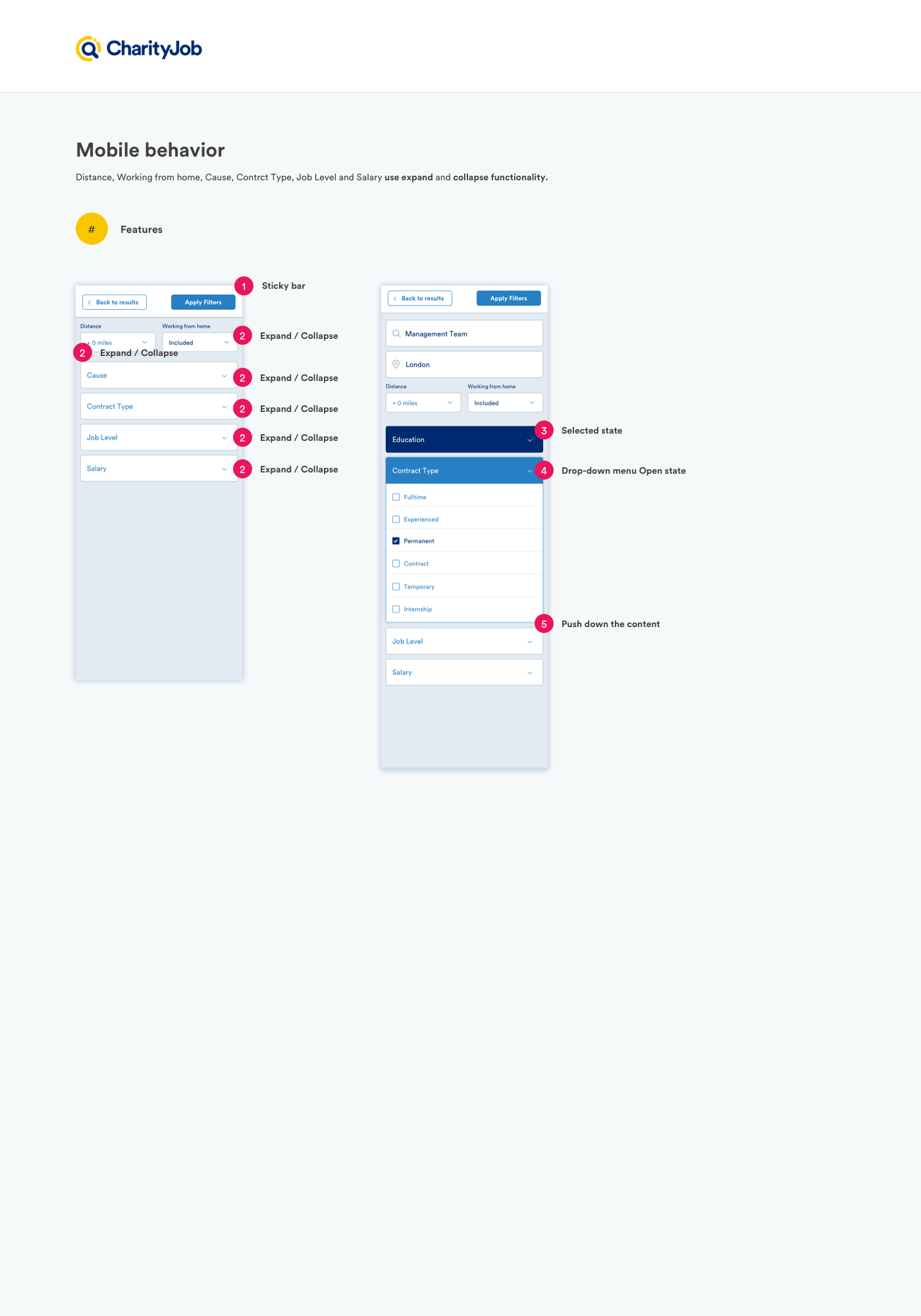
Mobile
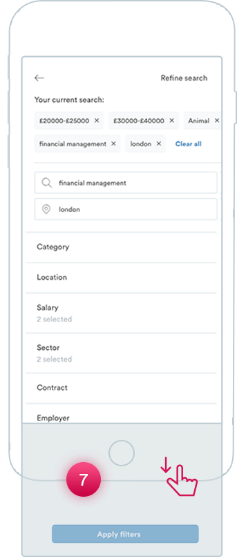
7. Apply Filter Button
The most critical issue on mobile is about the "apply filter" button because it is visible only if the the user swiep down the screen.
8. Refine Search
Users often tap in "refine search" thinking it will applied the filters but it's only plain text.
Other issues:
Lack of any visual clues to suggest what areas are clickable
Poor color contrast between the UI elements.
COMPETITIVE ANALYSIS
I conducted a research on other recruting sites to see patterns for the use of form UI components and layout options.
The client has done research internally, and we brainstormed together our findings. We discuss together the possible features and functionalities that could be implemented in the new site.
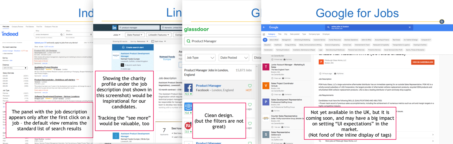
Some "features" and "ideas" were stored on the backlog for further development such as the two-panel layout because it required much time and resources even though it will have a high impact.
Also, the new search bar and filters were already a big change in the overall user experience, therefore implementing the two-panel layout might have been too much in one release.
*Update the two-panel layout is now live Sep 2019
IDEATING SOLUTIONS
Combining the qualitative data with the insights from competitors research, I started defining the solutions.
There were three main ele,emts to focus on and improve:
- Keyword input
- Locations input
- Filters options
I created a doc to write down all the features and functionalities to get a full overview of the whole search interaction. I defined the new set of filters and what were the labels and options to display.
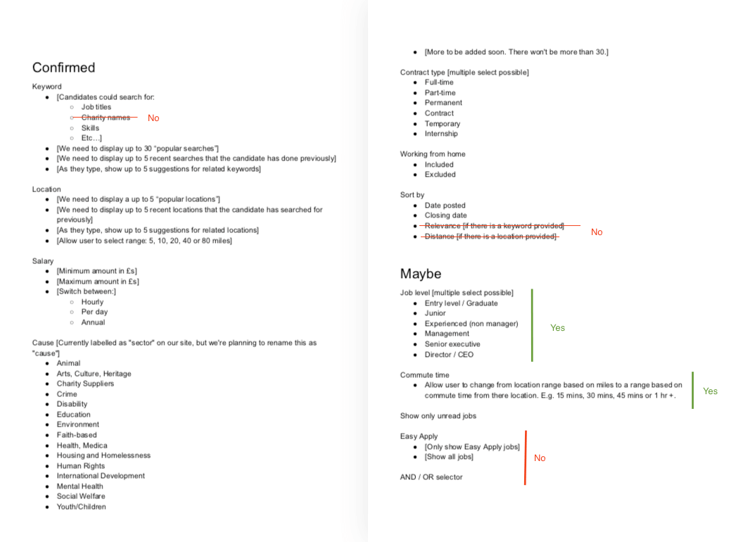
Wireframing
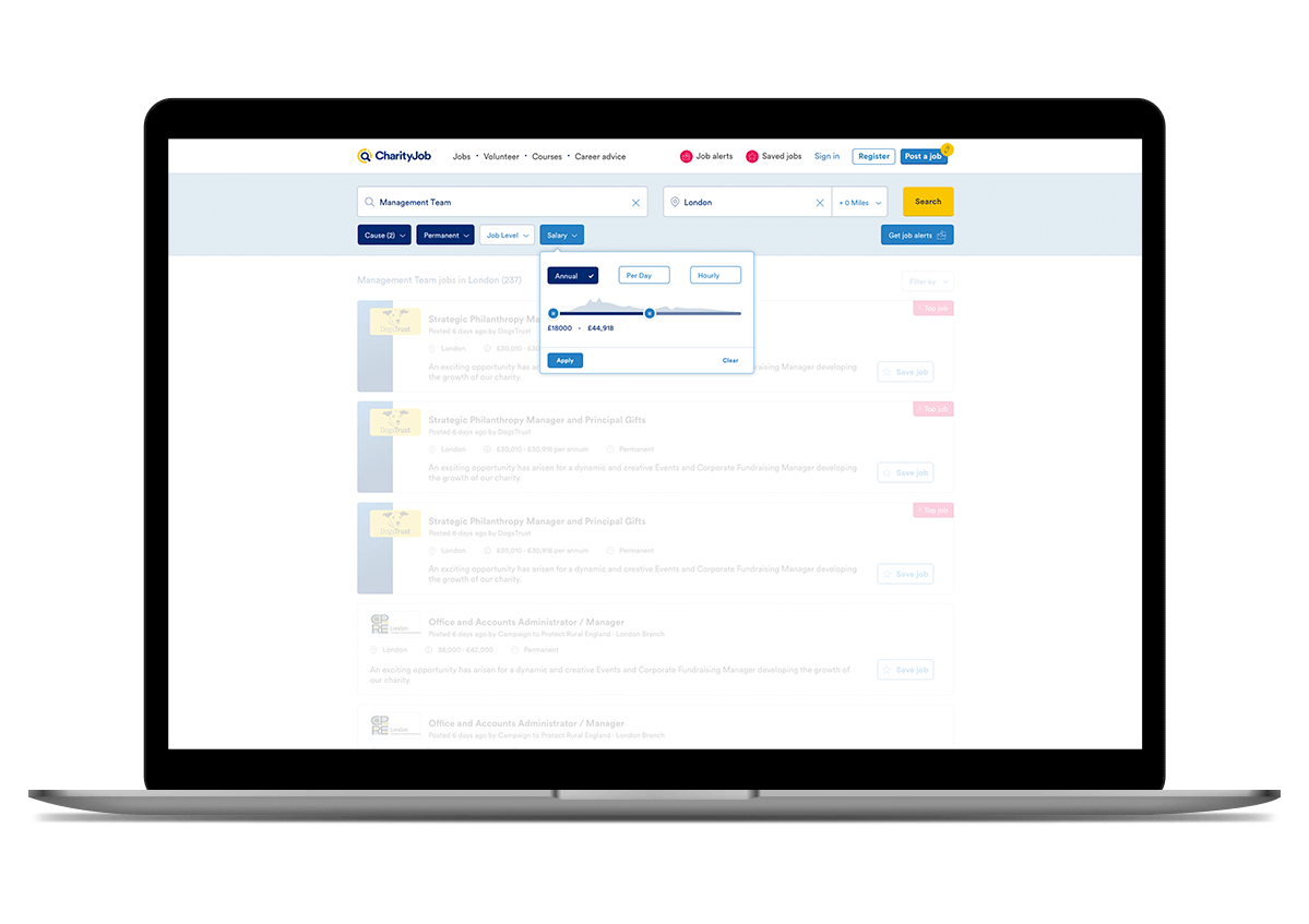
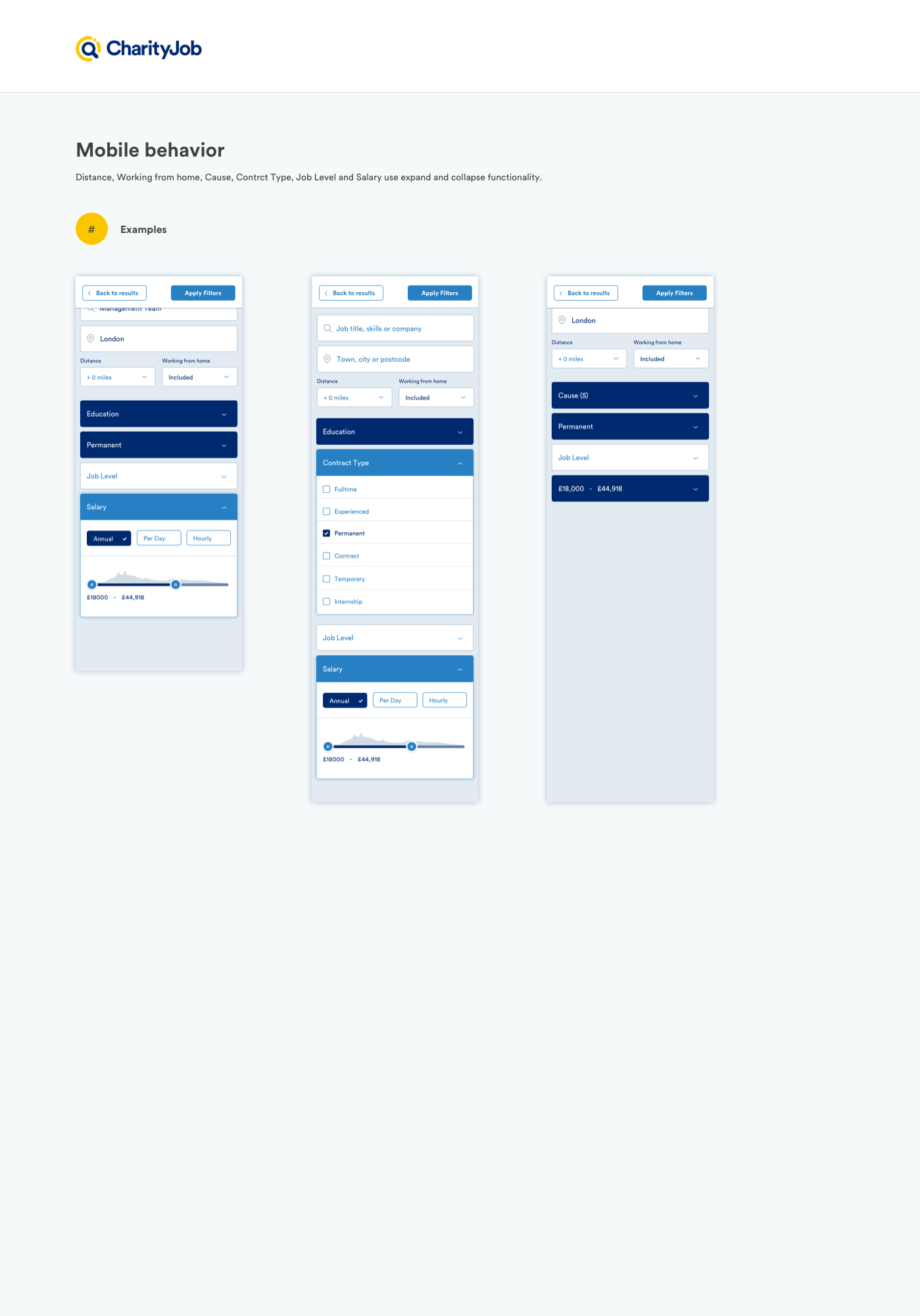
The new layout does not have a sidebar. The filters option are placed below the "keyword" and "location" fields, and the whole search bar is sticky. This new approach will help to get a sense of connection between the keyword/location inputs and the filters. All the options are also visible above the folds, so they are more accessible.
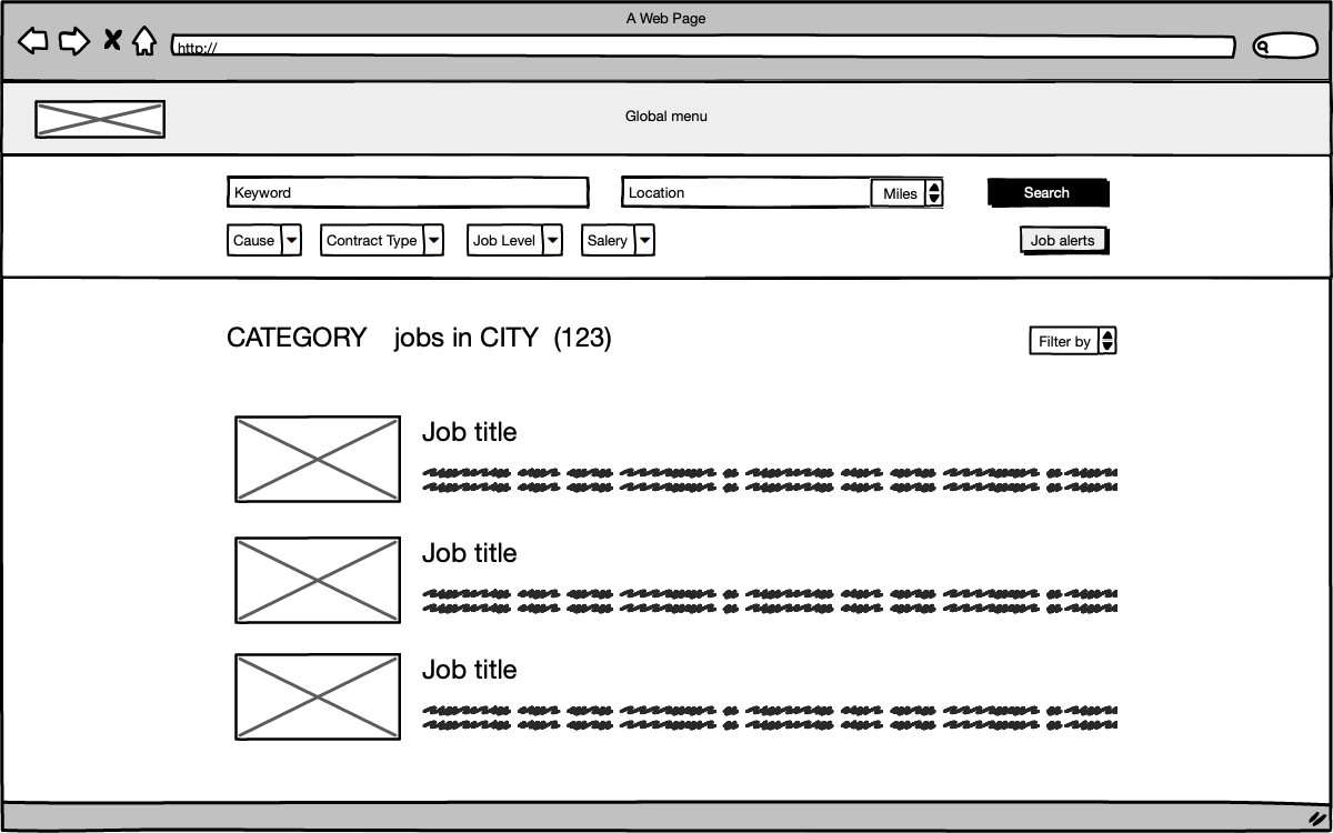
Some samples of the low-fidelity wireframe made with Balsamiq
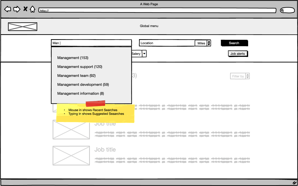
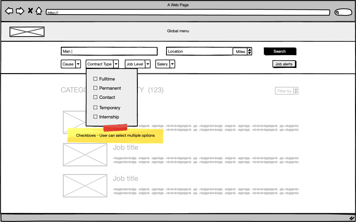
Exploring how the user can interact with the system
The next step was to explore all the possible alternatives for the drop-down filters and create a set of different interactions for the keyword and location input.
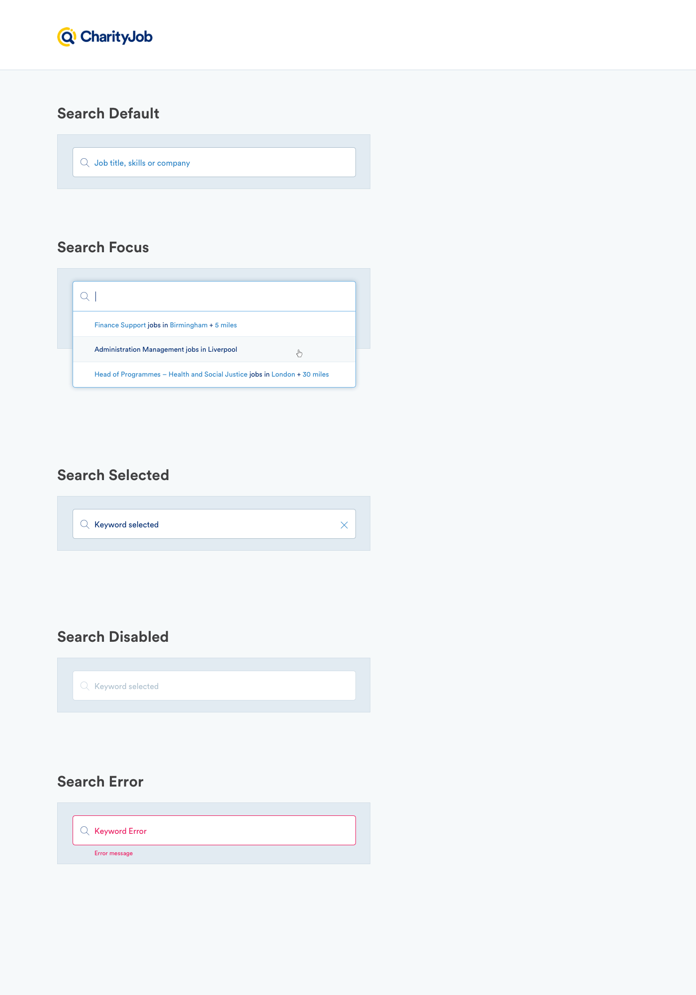
Keyword input example:
- Mouse in, the system displays the 5 most popular search if it is the first time the user visits the site
- Mouse in, the system displays the 5 recent searches for returning users
- Typing in, the system displays suggested results
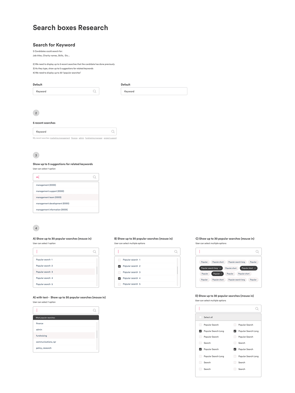
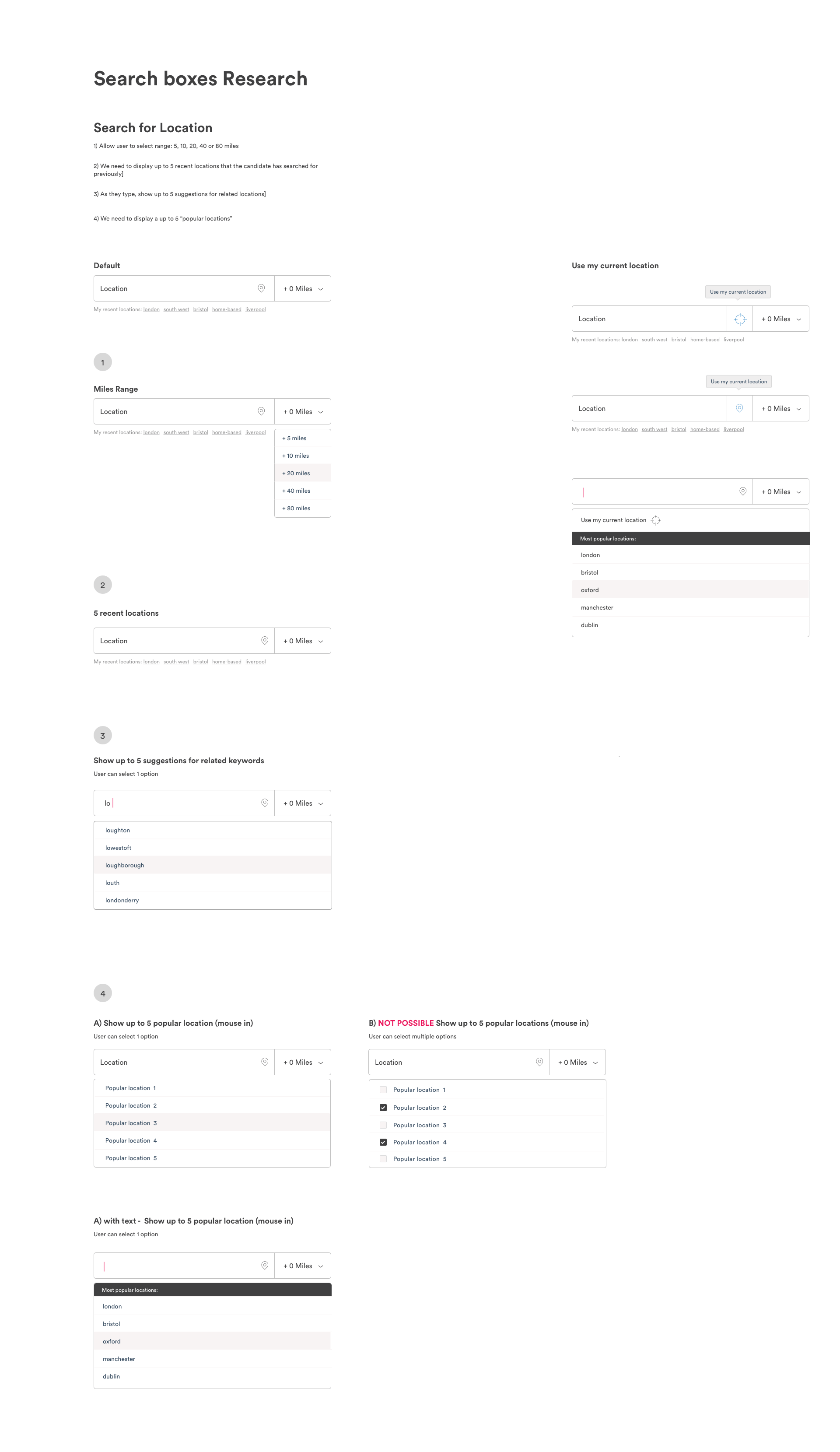
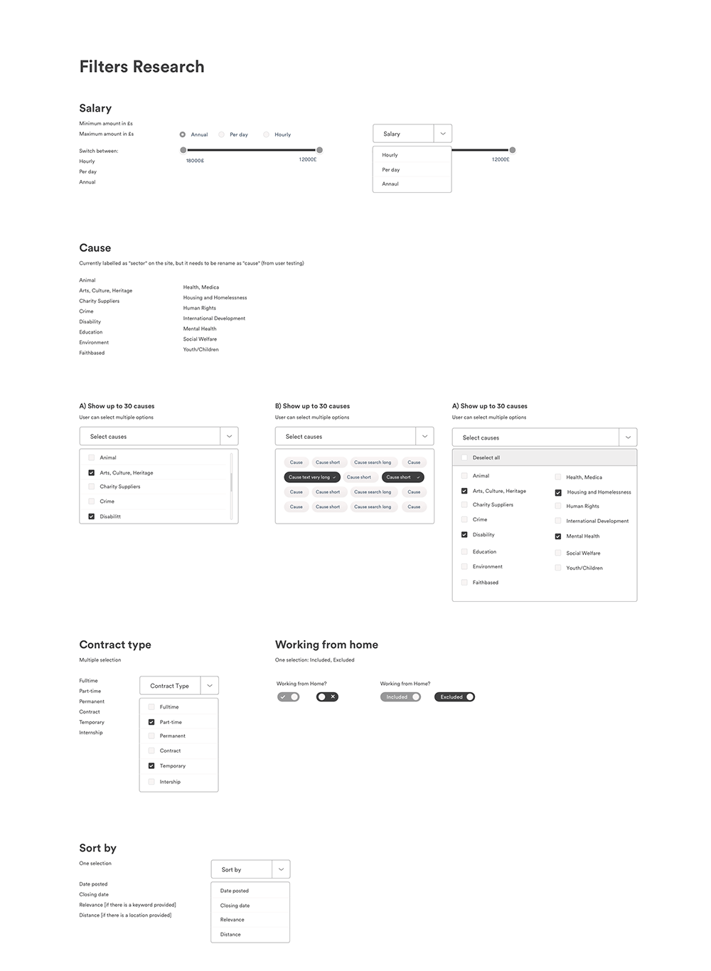
Testing, iterating and refining
We had some brainstorming sessions to validate the possible solutions, and we defined the alternatives to test. So I created medium-fidelity wireframes with Sketch, and we tested the prototype in InVision. We iterate based on users feedback, and once we get to the final prototype, I created the polished high fidelity mockups.
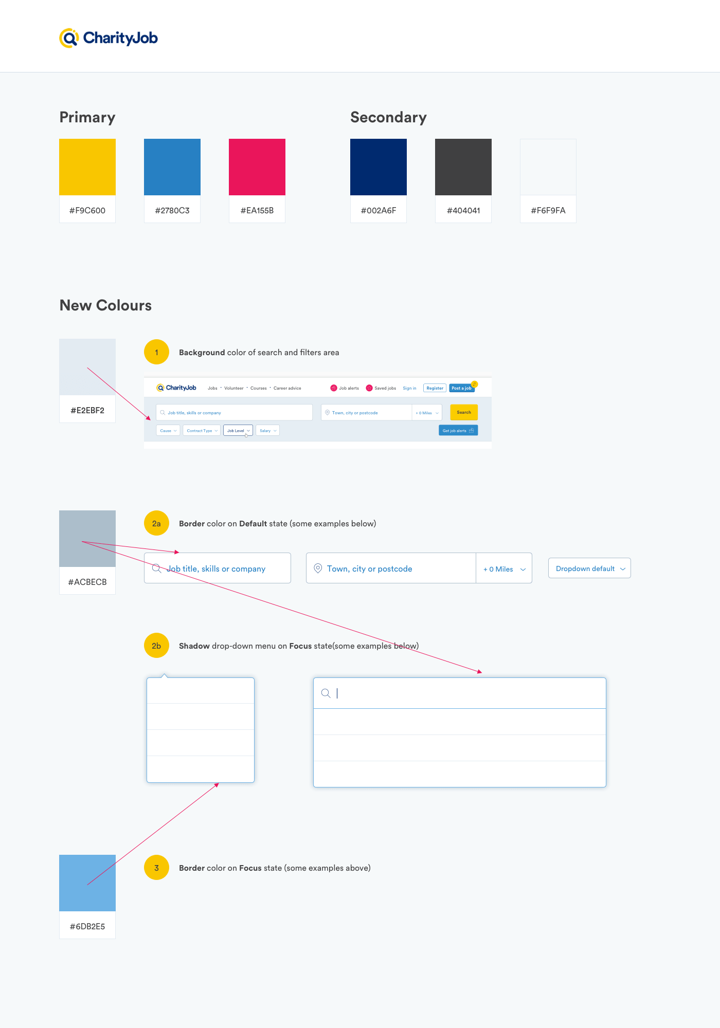
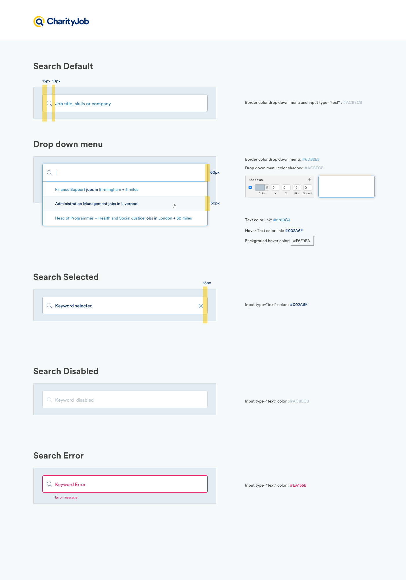
UI KIT and design handoff to web developers
Lastly I created the new UI KIT to handover the designs to the web developers.

⋮