BLOG
CharityJob
CharityJob
Converting blog readers into candidates users
Converting blog readers into candidates users
AGENCY
Moove Agency
CLIENT
CharityJob
SECTOR
Charity
YEAR
2017
OVERVIEW
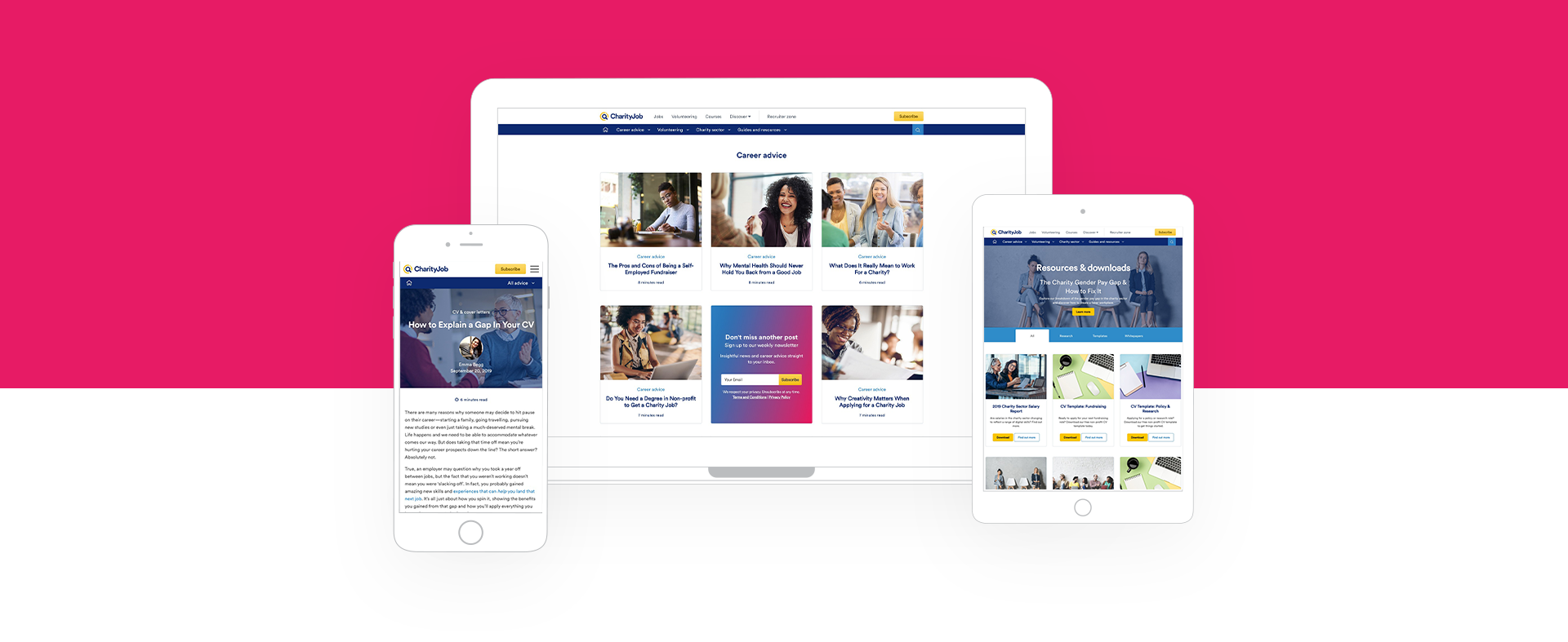
The blog aims to provide sector-specific career guidance, news and life skills. CharityJob blog is the "go-to" place for people in all stages of their job search when they need advice or inspiration.

MY ROLE
As the lead designer on this project, I was responsible for the UX process and UI design
The core team consisted of a full-stack Wordpress developer, a project manager, account manager and myself. From the client side, I worked closely with the Marketing Manager and Product manager.
Responsibilities:
- Gather requirements
- Produce new IA
- Produce user flows, sitemap and wireframes
- Present prototypes (Axure) to client stakeholders for internal validation and user testing
- Produce High-Fidelity Mockups
- UI Style Guide
- Working with developers for implementation and QA Testing
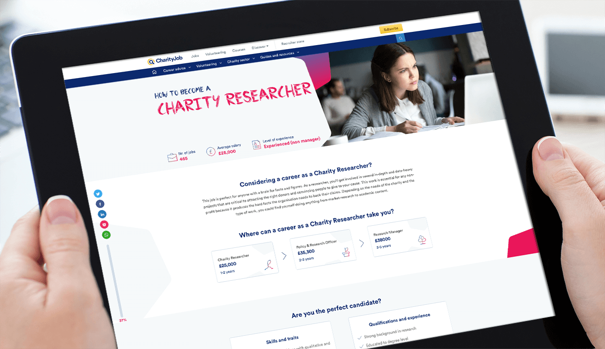
New temaplate: Guide Article Page
PERSONA
Candidates are predominantly based in the UK but an high percentage are internationals.
Key Fact about the Candidate Persona:
- Aged between 25 & 34
- Female
- Lives In the South of England looking for jobs in London
- Most popular sector of interest: Finance, Admin , Mental Health
- Degree educated
Needs:
- Inspiration and Advices about the charity sector
- Interviews Tips
- Guidance about how to write CV and cover letters when applying for a job
- Information about career path (Eg. how to become "Community Fundraising Manager")
Wants:
- Download resources such as template for CV, Cover letters
- Get update about events, webinars, news related to their sector of interest
- To get involved in volunteering opportunities
PROJECT GOOALS
The project started with a kik-off meeting where we agree on the primary project objectives and KPY's.
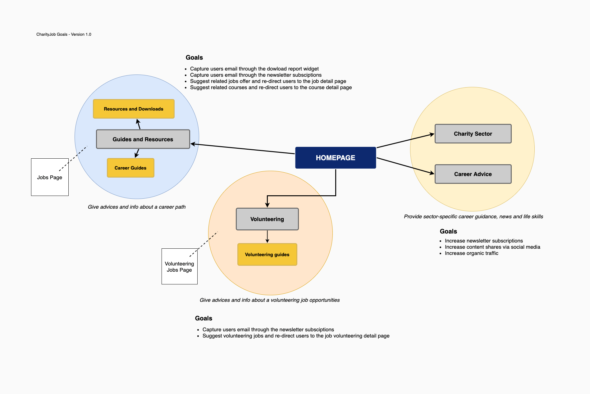
- Convert readers into CharityJob candidates users
- Improve the blogs IA with a better structure and sense of direction
- Increase newsletter subscriptions
- Increase content shares via social media
- Increase organic traffic
- Capture users emails through resources download form
- Capture users emails through newsletter signups
Project Goals
PROBLEMS
We run a workshop to outline the blog weakness.
Here are the findings:
- There isn’t enough consistency between the website and the blog
- The look and feel of the blog is too old. It needs to be as modern as the CharityJob website
- We have to manually change the content on the home page so they were looking for a CMS solution
- Not intuitive to navigate (needs to be better categorized)
- Lack of social media visibility
- Newsletter subscription needs to integrate straight from the blog to our email provider
- The website is not responsive while most of the users navigate the blog through mobile devices

Old Blog Homepage

Old Category Blog Articles

Old Blog Article Page
INFORMATION ARCHITECTURE
Re-organising the blog structure to improve the experience was a key step of the process.
I mapped out the old sitemap, run a card sorting exercise to define the new terminology for the menu categories and prosed new sitemap.
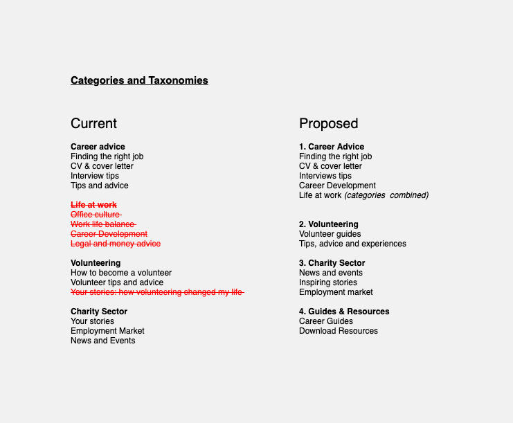
Categories & Taxonomies
Some categories were merged to streamline the menu navigation, and new ones were created from scratch as new content was needed to add into the blog such as the resources and guides section. Since we used WordPress as CMS, it was easy to re-organise the articles in the right category.
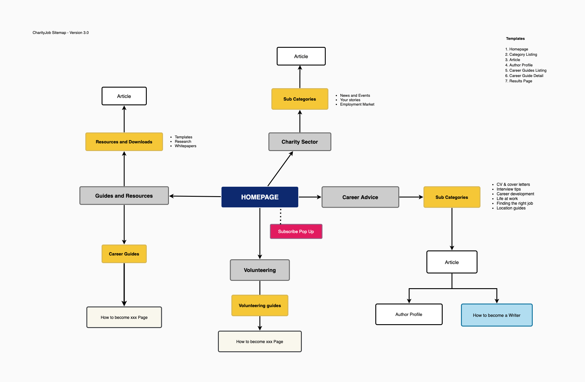
New sitemap
WIREFRAME
I started wireframing both desktop and mobile view for the new blog with Axure and the prototype was used to run user testing and get clients feedback as well.
A card-based approach to display the article overview was used on the homepage and category listing page because this layout is mobile-friendly. To increase the copy legibility and help users to focus on reading, I proposed the one-column layout on the articles page.
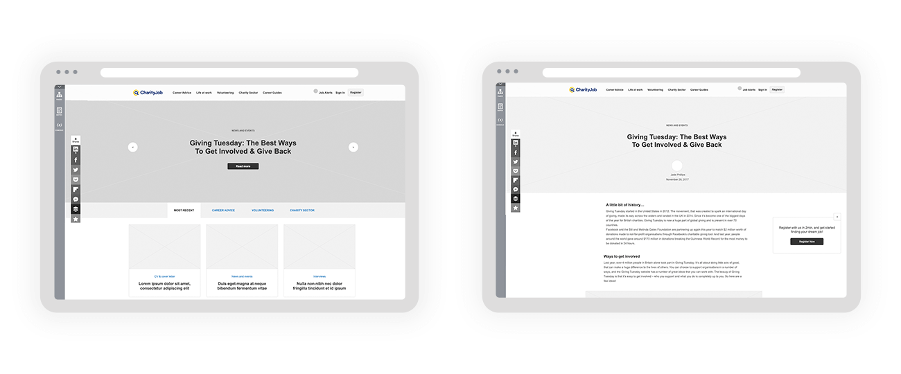
Wireframe samples Left: Homepage - Right: Article page
HOMEPAGE, ARTICLE CATEGORY PAGES, ARTICLE PAGES
To increase the newsletter subscriptions, we tested different alternative with the wireframe and the ones which were more succefful, were implemented in the new site.

1. The Homepage and Category Listing has a dedicated area among the articles cards. ..
2. The subscribe button on the top-right of the navigation bar opens a modal window with the email form.

3. The article page has a sticky bottom bar to subscribe, and it also includes the social media icons to share the article.
4. A signup box is placed at the bottom of the articles page, just below the suggested articles section.
RESOURCES PAGES
We designed from scratch the resources section. The goal was to capture the user emails.
To achieve that, we create a page where the users can see an overview of the Report content. To see the full report and download it, the user needs to fill in the form.
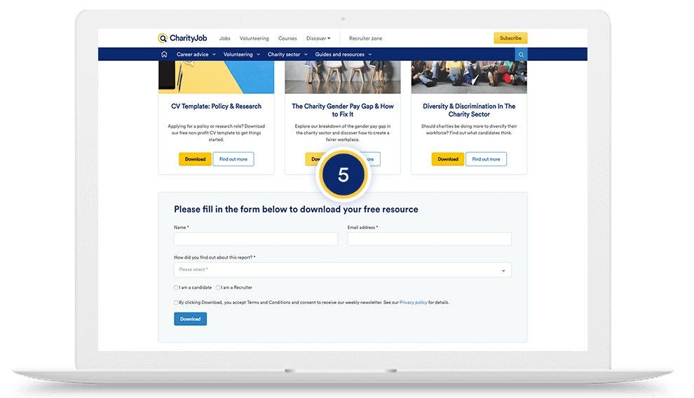
5. The users can quickly download the report, just clicking on the "download button" placed on each resource card. The button functions as a trigger to open the form.

6. On the articles page, the client can add a callout section from the CMS to promote a report on the page. The report is related to the article topic.
7. The resource page detail has a form on the right and and the report overview on the flet. The user can download the PDF report after fill in the form.
CAREER PAGES
The career guides page are meant to give candidates useful advices on how to follow a career path.
Scrolling down the page, we introduced two sections where there are displayed:
8. Related jobs and Related courses
The reader's persona is redirected to the job detail pages and courses pages with the purpose to potentially convert them into candidates and course attendants.

CLIENT TESTIMONIAL
Roberto was truly an incredible asset to the team when we chose to redesign the CharityJob blog. He got to grips with our brand quickly and understood what we were trying to achieve (he was also very flexible and made the changes that we requested without any hassle). We're already working with Roberto on another project because of the great work that he did with our blog. Amazing designer, lovely character and I highly recommend his work
Roberto is a design expert who is able to turn a specification into a visually appealing, user-friendly website. I commissioned Roberto as part of Moove Agency to design a corporate website which was intended to be the best in its sector. A team worker by nature, Roberto worked tirelessly with a small number of developers to produce exactly what was required.

JADE PHILLIPS
Marketing Manager at CharityJob
⋮
